
")
Last month, we helped redesign an online furniture store that was getting 5,000 monthly visitors but only converting 0.8% of them into customers. The owner was frustrated – great products, competitive prices, decent traffic, but terrible sales. After analyzing their site, the problem became obvious: their WooCommerce website design was actively preventing people from buying.
Their “Add to Cart” button was pale gray and barely visible. Product images were tiny. Customer reviews were buried at the bottom of pages. The mobile checkout process required 47 taps to complete a purchase.
Three weeks after implementing proven layout patterns, their conversion rate jumped to 3.2%. Same products, same prices, same traffic. The only difference? A design that actually helps people buy instead of confusing them.

Why Most WooCommerce Sites Feel Like Obstacle Courses
Here’s something that might surprise you: most online stores are accidentally designed to prevent sales. Business owners spend weeks perfecting product photos and writing descriptions, then bury everything behind confusing navigation and broken mobile layouts.
We’ve audited hundreds of WooCommerce sites, and the pattern is always the same. Beautiful products are presented in ways that make buying unnecessarily difficult.
Your desktop looks great. Your mobile site doesn’t. Most store owners design on laptops and never check how their site works on phones. Meanwhile, 60% of their customers are shopping on mobile devices during lunch breaks, commutes, or while watching TV.
Product information is scattered everywhere. Price in one corner, availability somewhere else, shipping details in a pop-up, reviews hidden behind tabs. Customers shouldn’t need to hunt for basic purchase information.
Checkout feels like filing taxes. Seventeen form fields, account creation requirements, unclear shipping costs, and payment methods that don’t work on mobile. Every extra step gives customers another reason to abandon their cart.
What Actually Makes People Buy Online
Successful WooCommerce website design works with human psychology, not against it. People make buying decisions based on emotion and justify them with logic. Your layout needs to support both processes.
Customers scan, they don’t read. Online shoppers spend seconds, not minutes, evaluating products. Information hierarchy matters. Price, availability, and key benefits need to be immediately visible.
Social proof drives decisions. People want to know others have purchased and loved your products. Reviews, ratings, “bestseller” badges, and “customers also bought” sections provide the validation that converts browsers into buyers.
Fear of making mistakes kills sales. Clear return policies, security badges, customer service contact information, and professional design all reduce purchase anxiety.
Mobile users have different needs. They’re often ready to buy immediately – call now, get directions, make quick purchases. But they’re also more easily frustrated by small buttons, slow loading, or complicated processes.
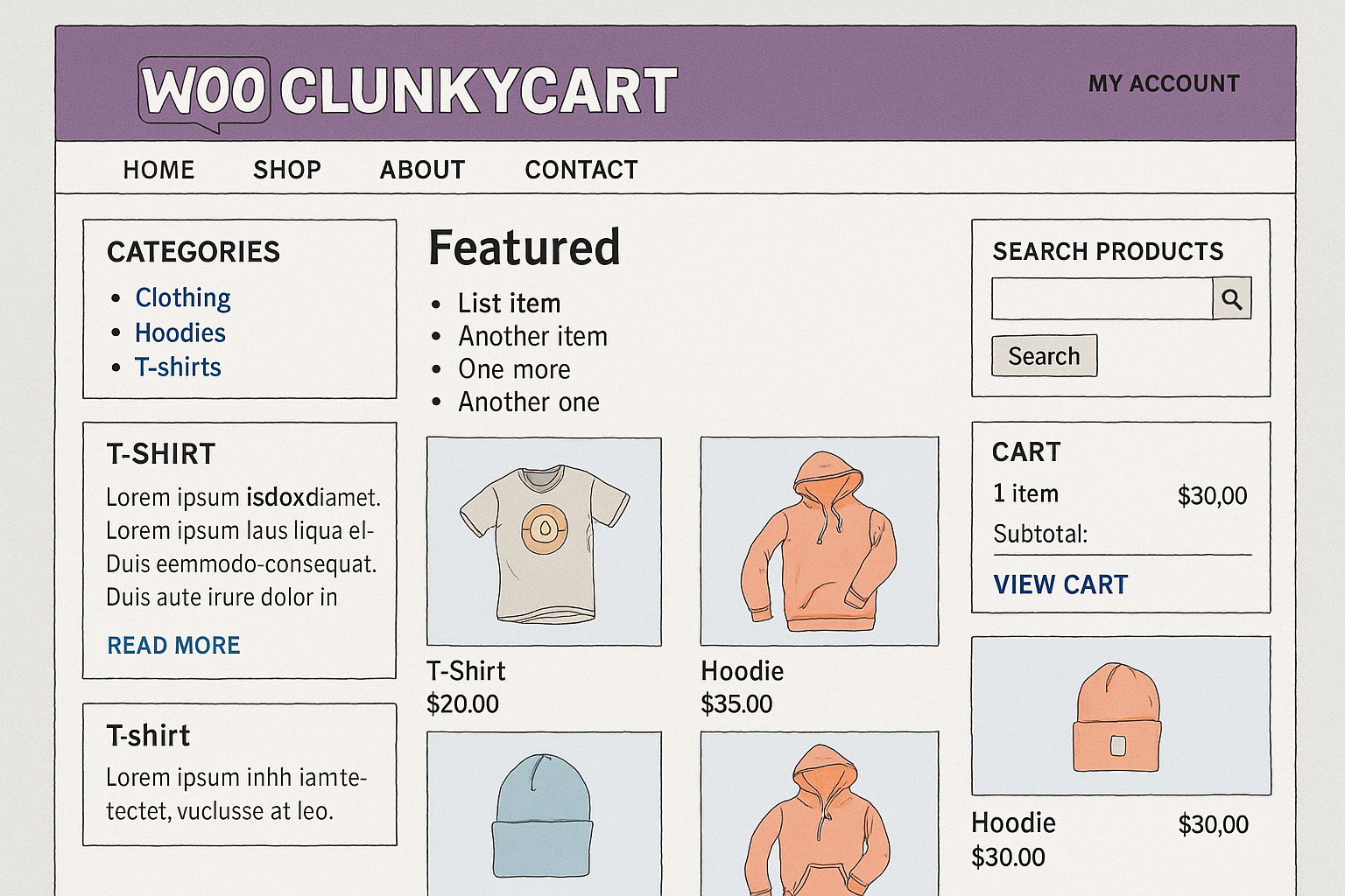
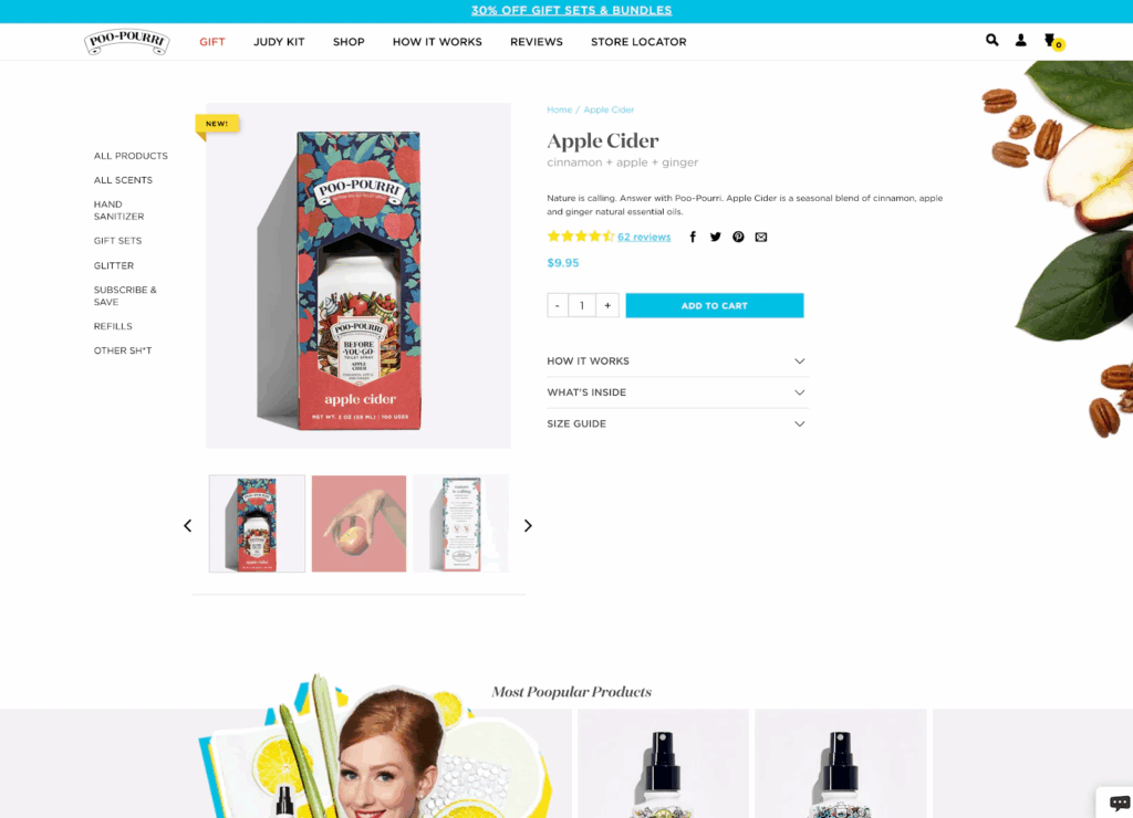
The Product Page Layout That Converts
Your product pages are where buying decisions happen. We’ve tested dozens of layout variations and consistently see the same patterns work best.
The Above-the-Fold Formula
Large, high-quality product image takes up the left half of the screen on desktop. Multiple angles, zoom functionality, and lifestyle shots let customers examine products thoroughly.
Essential purchase information clusters on the right: product title, price (including any discounts), availability status, and brief description. Everything customers need to decide should be visible without scrolling.
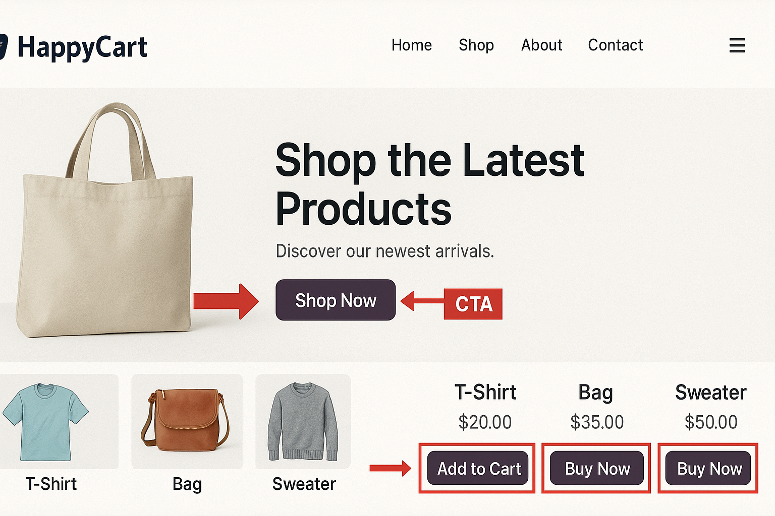
Clear “Add to Cart” button uses contrasting colors and action-oriented text. “Add to Cart,” “Buy Now,” or “Get Yours Today” work better than generic buttons.
Trust elements appear strategically: security badges, shipping information, and return policy links. These address common objections before they form.
The Social Proof Section
Customer reviews deserve prominent placement, not hidden tabs. Position them immediately below the product fold, where they reinforce buying intent.
Star ratings appear multiple times – near the title, in the review section, and in search results. Consistent visibility builds credibility.
Review highlights showcase the most helpful feedback, focusing on benefits and addressing common concerns.
Customer photos provide social proof and help shoppers visualize products in real contexts.
Mobile-Specific Considerations
Mobile product pages need different layouts because shopping behavior changes on small screens.
Single-column design eliminates horizontal scrolling and makes information easy to consume.
Larger touch targets ensure buttons work reliably with thumb navigation.
Streamlined information prioritizes essential details and hides secondary information behind expandable sections.
Sticky “Add to Cart” button stays visible as users scroll through product details.
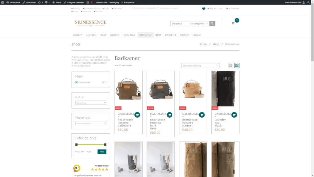
Category Pages That Guide Customers
Category and shop pages often get neglected, but they’re crucial for helping customers find the right products.
Filtering That Actually Helps
Visual filters for color, size, and style help customers narrow options without overwhelming cognitive load.
Smart defaults like “most popular” or “best sellers” guide indecisive shoppers toward proven products.
Clear sorting options include price (low to high, high to low), popularity, newest arrivals, and customer ratings.
Product Grid Optimization
Each product in your grid should work like a mini-advertisement:
High-quality thumbnails show products clearly and consistently.
Visible pricing, including any discounts or special offers.
Quick access to ratings and key product details.
Hover effects reveal additional images or information without requiring clicks.
The Checkout Process That Actually Works
Cart abandonment kills more sales than any other factor. The average abandonment rate is nearly 70%, but optimized checkouts perform much better.
Reducing Friction
The guest checkout option eliminates forced account creation that drives customers away.
Progress indicators show exactly where customers are in the process and how many steps remain.
Multiple payment options include credit cards, PayPal, Apple Pay, and buy-now-pay-later services.
Mobile-optimized forms use large input fields and minimal required information.
Building Confidence
Security badges and SSL certificates address safety concerns.
Clear shipping and return policies appear throughout the checkout process.
Order summary stays visible so customers know exactly what they’re buying.
Contact information makes customer service easily accessible if problems arise.
Common WooCommerce Design Mistakes
The Information Overload Problem
Many stores try to include every possible detail about products, overwhelming customers with choices and information. Less is often more – prioritize the details that actually influence buying decisions.
Weak Product Photography
Stock photos and manufacturer images don’t build trust or showcase products effectively. Customers want to see products in real-world contexts, different angles, and actual use.
Complicated Navigation
Multi-level menus and complex category structures confuse customers. Simple, logical navigation keeps people moving toward purchases.
Missing Trust Signals
Professional design, clear policies, customer service information, and security badges all contribute to purchase confidence. Skip these elements, and visitors leave without buying.
Generic Call-to-Action Elements
“Submit” buttons and vague instructions don’t motivate action. Clear, benefit-focused language performs significantly better.

All Things WordPress – Design & Optimization
We craft WordPress websites that combine stunning visuals with performance and usability—so your brand makes the right impression and drives measurable results.
- Custom WordPress design
- Conversion-focused layouts
- Complete website redesigns
Advanced Layout Techniques
Upselling and Cross-Selling Placement
Strategic product recommendations increase average order values when positioned correctly:
“Frequently bought together” sections appear on product pages before customers add items to the cart.
Related product suggestions show during the shopping process without being pushy.
Cart page recommendations offer complementary items before checkout begins.
The Psychology of Product Presentation
Scarcity indicators like “only 3 left in stock” create urgency when used authentically.
Social proof through “bestseller” badges and customer counts builds popularity perception.
Comparison tools help customers choose between similar products without leaving your site.
Testing Beyond Browser Resize
Most people test WooCommerce websites by making their browser smaller. This catches obvious layout problems but misses crucial user experience issues.
Real device testing reveals problems that desktop simulation can’t:
- Touch interaction problems become immediately obvious
- Loading speed issues on cellular connections
- Form usability with mobile keyboards
- Payment method compatibility
We test every store on multiple devices with different screen sizes, operating systems, and connection speeds.
The Business Impact of Better Design
Conversion Rate Improvements
Small design changes often produce significant results. Moving an “Add to Cart” button, improving product images, or streamlining checkout can increase conversion rates by 20-50% or more.
Higher Average Order Values
Strategic cross-selling, bundle offers, and related product suggestions increase the amount customers spend per purchase.
Reduced Cart Abandonment
Optimized checkout processes and clear shipping information keep more customers completing their purchases.
Better Mobile Performance
Mobile-optimized designs capture sales from the growing majority of customers who shop on smartphones.
Getting Started Without Overwhelming Yourself
Priority One: Fix Your Product Pages
Start with your best-selling products. Optimize their layouts using the patterns above, then measure the impact before expanding to your entire catalog.
Focus on Mobile First
Check your most important pages on actual smartphones. If something doesn’t work well on mobile, fix it immediately.
Test One Change at a Time
Change product page layouts, then measure results. Optimize checkout, then test again. Multiple simultaneous changes make it impossible to know what’s working.
Use Real Customer Feedback
Ask customers about their shopping experience. Where did they get confused? What information was hard to find? Their insights often reveal problems you’d never notice.
The Long-Term Perspective
WooCommerce website design isn’t about following trends or copying competitors. It’s about understanding your customers’ shopping behavior and removing obstacles that prevent purchases.
Start with the fundamentals: clear product information, easy navigation, trustworthy design, and mobile optimization. Test different approaches with real customers and let data guide your decisions.
Remember that successful e-commerce design evolves continuously. Customer expectations change, new devices appear, and your product catalog grows. The best online stores constantly optimize their designs based on performance data and customer feedback.
All Things WordPress – Design & Optimization
We craft WordPress websites that combine stunning visuals with performance and usability—so your brand makes the right impression and drives measurable results.
- Custom WordPress design
- Conversion-focused layouts
- Complete website redesigns
Making the Investment
Professional WooCommerce website design pays for itself through improved sales performance. Even small improvements in conversion rates, average order values, or cart completion rates can generate significant revenue increases.
But you don’t need to redesign everything at once. Start with your highest-impact pages, measure results, and expand successful patterns throughout your store.
Your products deserve a presentation that matches their quality. Your customers deserve shopping experiences that make buying easy and confident. WooCommerce website design patterns that actually sell products deliver both.
The difference between a store that gets visitors and one that generates consistent sales often comes down to these layout principles. Your bottom line will thank you.