

Last week, we watched a client lose a major sale because their website looked terrible on mobile. The prospect had found them through Google, loved what they saw on the homepage, but when they tried to fill out the contact form on their iPhone during lunch break, the form fields were so small they couldn’t even tap the right buttons. Frustrated, they went with a competitor instead.
This isn’t unusual. It happens every single day to businesses that think desktop testing is enough.

Your Laptop Screen Lies to You
Here’s something most people don’t realize: your laptop represents maybe 30% of how people actually view websites. The rest are squinting at phones while waiting for coffee, browsing on tablets from their couch, or checking your site on ancient work computers with weird resolutions.
When you design only for your screen, you’re essentially telling 70% of your audience they don’t matter.
Mobile traffic now dominates most industries. E-commerce, professional services, restaurants, real estate – you name it. Yet we still see business owners who’ve never once looked at their own website on a phone. They assume their theme handles everything automatically.
Big mistake.
What Responsive Design Actually Means (Hint: It’s Not Just Shrinking Things)
Responsive WordPress design isn’t about making your desktop site smaller. It’s about reimagining how your content works on completely different devices with different capabilities.
On a desktop, people scan with precision mouse cursors. On mobile, they scroll with thumbs while walking down busy streets. These aren’t minor differences – they require fundamentally different design approaches.
A truly responsive site reorganizes itself intelligently. Your three-column layout becomes a single column. Your hover menus transform into thumb-friendly buttons. Your tiny text becomes readable without zooming. Everything shifts to match how people actually use that specific device.

The Expensive Mistakes We See Every Day
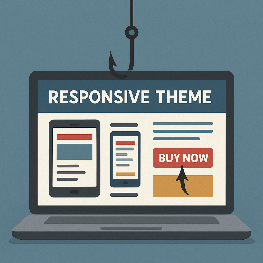
The “Responsive Theme” Trap
Buying a responsive theme doesn’t automatically make your site responsive. Themes provide the foundation, but every customization you make, every plugin you install, every image you upload can break that responsiveness.
We’ve seen $5,000 websites become unusable because someone added a simple contact form that wasn’t mobile-optimized. The theme was responsive. The form wasn’t.
Designing for Fingers, Not Mouse Cursors
Your desktop users click with laser precision. Mobile users tap with fingers that cover multiple elements at once. If your buttons are too close together, people will accidentally hit the wrong thing and get frustrated.
We always tell clients: if you can’t easily tap it with your thumb while holding your phone one-handed, it needs to be bigger or repositioned.
Ignoring Real Loading Conditions
Your office WiFi loads everything instantly. Your customers are often on spotty 4G connections while commuting. A beautiful responsive design that takes 10 seconds to load is worthless.
This is especially true for image-heavy sites. That stunning gallery that looks amazing on your desktop might crash someone’s mobile browser or eat up their entire data plan.

All Things WordPress – Design & Optimization
We craft WordPress websites that combine stunning visuals with performance and usability—so your brand makes the right impression and drives measurable results.
- Custom WordPress design
- Conversion-focused layouts
- Complete website redesigns
What Good Responsive Design Looks Like in Practice
Navigation That Actually Works
Desktop navigation can be complex – multiple dropdown menus, hover states, lots of options. Mobile navigation needs to be ruthlessly simplified.
The best mobile menus hide complexity behind clean interfaces. Everything important stays accessible, but secondary options tuck away neatly. Users can find what they need without getting overwhelmed.
Content That Flows Naturally
Good responsive design doesn’t just stack desktop columns vertically. It rethinks content hierarchy completely. The most important information comes first. Related content groups together logically. Users never have to hunt for basic information.
We’ve seen sites where the phone number was buried at the bottom on mobile, even though calling is the primary action most mobile users want to take. That’s backwards thinking.
Forms People Can Actually Use
Mobile forms are where bad responsive design shows its true colors. Tiny input fields, labels that disappear, submit buttons you can’t find – these issues kill conversions instantly.
Well-designed mobile forms use large input areas, clear labels, and smart keyboard triggers. When someone taps a phone field, the number pad opens automatically. Email fields trigger the @ symbol keyboard. These details matter enormously.

The WordPress-Specific Challenges
WordPress gives you incredible flexibility, but that flexibility can create problems. Every theme handles responsiveness differently. Every plugin adds its own CSS that might conflict with your responsive design.
Block Editor Complications
The Gutenberg editor makes content creation easier, but it can also break responsive layouts if you’re not careful. Nested columns that look perfect on desktop might create horizontal scrolling on mobile. Custom spacing that works great on large screens might leave huge white gaps on phones.
Plugin Conflicts
We regularly see sites where everything looks great until you add a calendar plugin, contact form, or e-commerce component. Suddenly, mobile users can’t scroll properly, or text overflows its containers.
The solution isn’t avoiding plugins – it’s testing every addition on multiple devices before going live.
Image Management
WordPress handles basic image resizing automatically, but it doesn’t optimize for mobile loading speeds or handle complex layouts intelligently. You need to actively manage how images behave across different screen sizes.
Testing Beyond Browser Resize
Most people test responsive design by making their browser window smaller. This catches obvious layout issues but misses crucial mobile-specific problems.
Real device testing reveals issues that desktop simulation can’t:
- Touch target problems become obvious immediately
- Loading speed issues are impossible to ignore
- Text readability problems show up under different lighting conditions
- Battery drain from inefficient code affects user experience
We keep an old Android phone specifically for testing. If a site works well on outdated hardware with a slower connection, it’ll work great for everyone.
All Things WordPress – Design & Optimization
We craft WordPress websites that combine stunning visuals with performance and usability—so your brand makes the right impression and drives measurable results.
- Custom WordPress design
- Conversion-focused layouts
- Complete website redesigns
The Business Impact You Can’t Ignore
SEO Consequences
Google ranks mobile versions of websites first now. If your mobile experience is poor, your search rankings suffer across all devices. This creates a downward spiral where bad mobile design leads to less traffic, which leads to fewer customers finding you at all.
Conversion Rate Reality
Mobile users convert differently from desktop users. They’re often ready to take immediate action – call now, get directions, make a purchase. But they’re also more easily frustrated and likely to abandon if anything doesn’t work perfectly.
We’ve seen conversion rates double just from fixing mobile form issues. The traffic was always there; the site just wasn’t capturing it.
Competitive Advantage
Most small businesses still have terrible mobile experiences. Getting this right gives you an immediate edge over competitors who are stuck thinking desktop-first.
When your mobile site works beautifully and theirs doesn’t, customers remember the difference.
Getting Started Without Overwhelming Yourself
Priority One: Test Your Current Site
Before changing anything, understand what you’re working with. Check your most important pages on at least three different phones. Look for obvious problems:
- Can you easily tap all the buttons?
- Is the text readable without zooming?
- Do forms work properly?
- Does everything load reasonably fast?
Start with High-Impact Pages
You don’t need to fix everything at once. Focus on the pages that matter most for your business – homepage, contact page, key service pages. Get these working perfectly before tackling less critical content.
Monitor What Actually Happens
WordPress analytics plugins can show you exactly how mobile users behave on your site. Where do they get stuck? Which pages have high bounce rates? This data guides your improvement efforts much better than guessing.
Common WordPress Responsive Solutions
Theme Selection Strategy
Choose themes from developers who actively maintain and update their code. Look for themes that have been tested with popular plugins you plan to use. Read recent reviews to see if other users have mobile issues.
Avoid themes with too many bells and whistles. Simple, clean designs are easier to keep responsive as you customize them.
Essential Performance Plugins
Caching plugins like W3 Total Cache or WP Rocket make dramatic differences in mobile loading speeds. Image optimization plugins like Smush automatically compress files without quality loss.
These aren’t optional for mobile users – they’re requirements.
Testing Tools That Actually Help
Google’s Mobile-Friendly Test catches basic issues, but real insight comes from tools like GTmetrix mobile testing and actual device testing with friends or customers.
Ask people to try using your site on their phones while you watch. You’ll discover problems you never would have found otherwise.
The Long-Term Perspective
Responsive design isn’t a one-time fix. New devices appear constantly with different screen sizes and capabilities. Your content changes. Your business evolves. Maintaining a good mobile experience requires ongoing attention.
But here’s the good news: once you develop mobile-first thinking, it becomes natural. You start considering mobile users in every decision. You test on phones automatically. You choose solutions that work everywhere instead of just on your laptop.
Making the Investment
Professional responsive design work pays for itself quickly through improved user experience, better search rankings, and higher conversion rates. But even if you’re handling improvements yourself, the principles remain the same.
Stop designing for your laptop screen. Start designing for your customers’ reality.
Every person who visits your site on their phone deserves the same great experience you see on your desktop. When you deliver that consistently, your business benefits in ways that go far beyond web design.
Your laptop screen will always look perfect to you. But your success depends on how your site works for everyone else, on every device they use to find you. Hiring a professional WordPress Design agency can be a good choice to avoid the hassles of developing on your own.
That’s the difference between a website that works and one that actually grows your business.