Responsive eLearning Design Isn’t Optional-It’s Essential for Boosting Online Course Enrollments

May 5, 2025, 5:20 PM

Source
You’ve probably heard the term “responsive” tossed around in web design circles for years. It usually means a site that works well on all screen sizes.
But when it comes to online courses, what does responsive design really look like? And more importantly, how does it impact your learners' experience and your course’s performance?
In this article, we’ll take a closer look at how the concept of responsiveness goes beyond just mobile-friendliness and why it plays a much bigger role in boosting engagement, retention, and enrollments for modern course creators.
The Problem with “Almost Responsive” eLearning Websites
Even if your LMS technically “works,” some subtle design choices might still be holding your course back. Let’s look at a few of those silent blockers.
A Hidden Lag in Interaction Design
Your course might pass the speed test, but does it feel fast?
There’s a big difference between a site that loads in three seconds and one that responds instantly to taps, scrolls, and clicks. If learners are waiting for videos to buffer or if interactive elements like quizzes or buttons respond sluggishly, especially on mobile, it creates friction. Even minor scroll delays can affect how learners perceive your course.
Think of platforms like Netflix. You don’t just want it to open—you expect it to run smoothly, without delays. That’s the same expectation modern learners bring to your LMS.
Fix it: Test your site’s perceived performance using an effective AI tool. Look beyond load time and check metrics like First Input Delay (FID) and Time to Interactive (TTI) to get a more realistic picture.
Related Reading: LMS Performance and Conversion: How Slow Loading Times Affect Enrollments |
The One-Size-Fits-All Design Trap
Just because your theme is labeled “responsive” doesn’t mean it delivers a personalized experience.
If learners on desktops and mobile devices see the exact same layout, or if someone on a weak internet connection is served heavy media files, it can seriously disrupt engagement. What works well on a wide screen with fast Wi-Fi won’t always translate to a phone on 4G in a noisy environment.
It’s like handing the same gear to a mountain climber and a jogger. Technically, it fits, but it’s not designed for how they’re using it.
Fix it: Use context-aware design techniques. Platforms like LearnDash or TutorLMS support conditional content based on device type, screen size, or even network speed. That way, you’re not just resizing—you’re optimizing the experience.
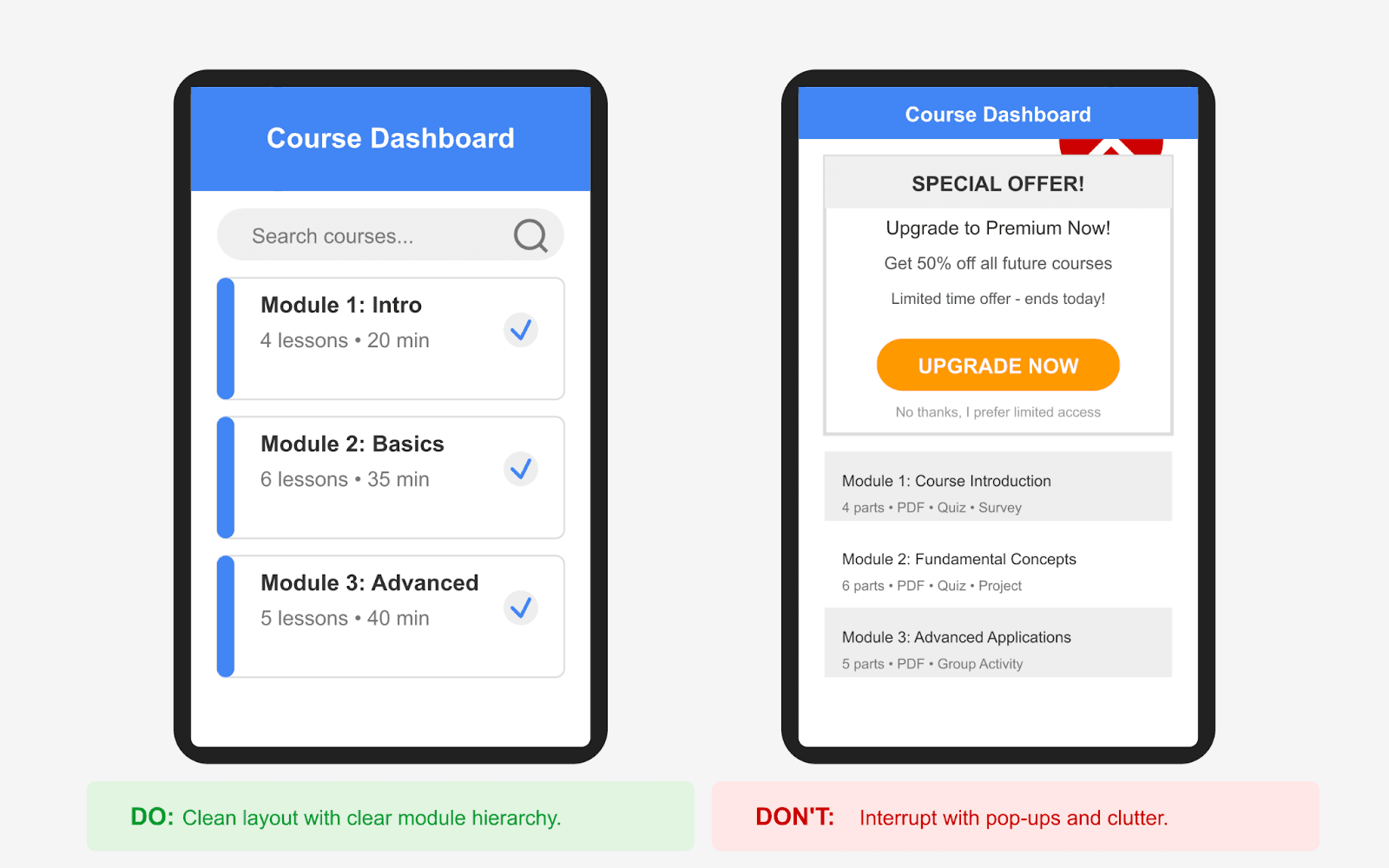
Layout Fatigue: When "Clean" Feels Boring
Minimalist design has its place—but if it leaves learners feeling lost, unmotivated, or unsure of their progress, it’s working against you.
Ask yourself:
Do learners know how far they’ve come in the course?
Are they getting any feedback or encouragement as they move forward?
Does your layout adapt to keep momentum going?
Platforms like Duolingo are great at this. They use progress bars, subtle animations, and even celebratory nudges to keep learners engaged.
Fix it: Try adding lightweight micro-UX elements—like “You’re halfway there” banners, hover effects, or smart transitions between lessons. These touches are easy to implement with lightweight JavaScript and won’t slow down your course.
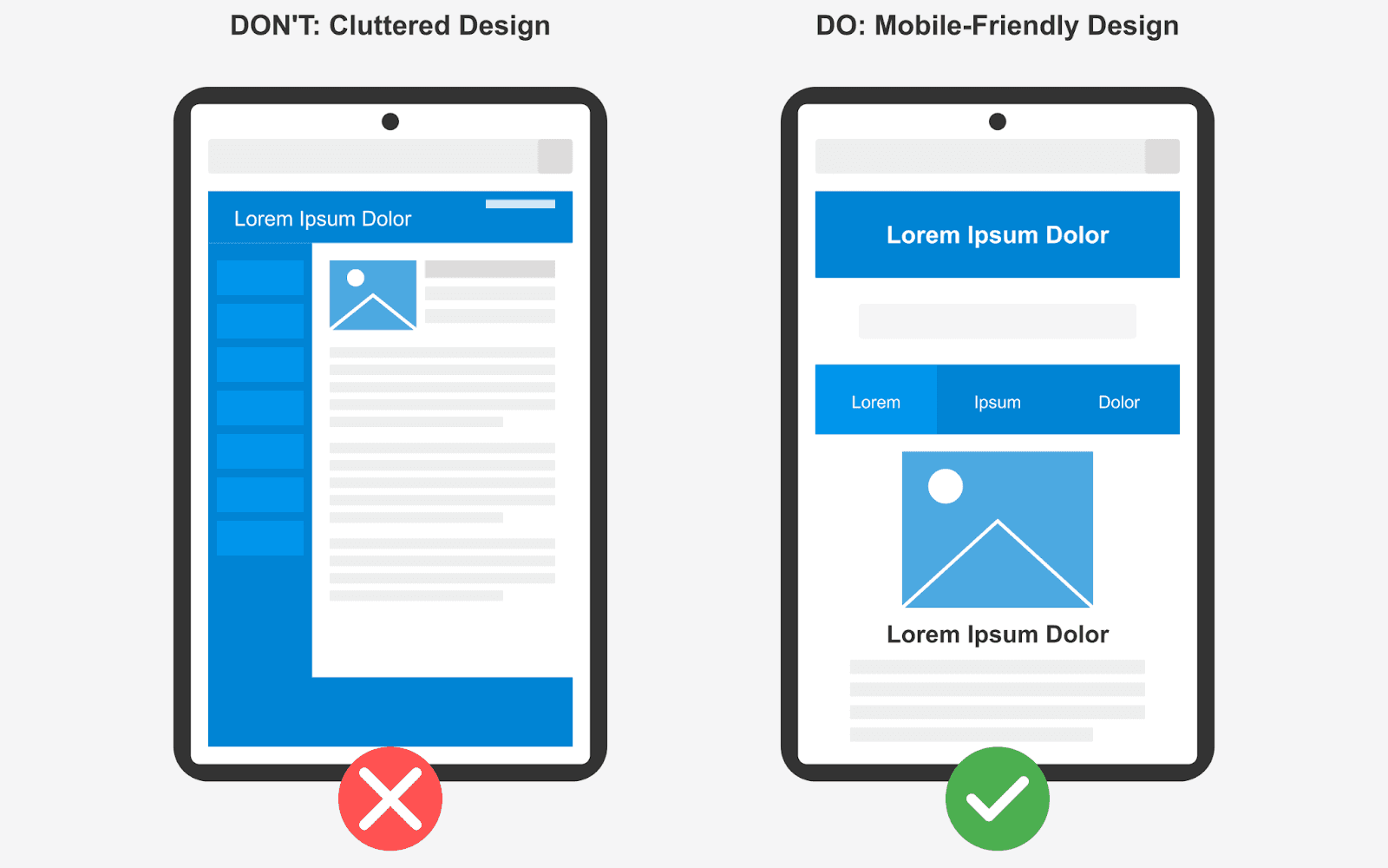
What Is Responsive eLearning Design?
Responsive eLearning design is all about making sure your course looks good and works well no matter what device someone is using—whether it’s a laptop, tablet, or phone.
Instead of creating different versions for each screen size, you design one course that automatically adjusts itself to fit. The layout, text size, images, and navigation elements rearrange to give learners a smooth experience across devices.
This means:
No awkward zooming or side-scrolling on mobile
Content loads cleanly and clearly on smaller screens
Navigation stays intuitive, whether you're clicking with a mouse or tapping with a thumb
It’s not just about flexibility—it’s about convenience. Learners can start a course on their desktop, continue it on their phone during a commute, and maybe finish it on a tablet later that night, all without any hiccups.
Plus, it’s cost-effective. Instead of hiring a larger team to build and manage different layouts, you can get a great learning experience up and running with fewer hands on deck.
With responsive eLearning design, you're not building a course for devices—you’re building it for learners, no matter how or where they access it.

Responsive eLearning Design in Action Anika is a freelance designer trying to upskill in UX. She starts a module at home on her desktop, but has to leave mid-way to pick up her daughter from school. While waiting in the car, she pulls out her phone and picks up right where she left off—no pinch-zooming, no distorted layouts. Later that night, she reviews a few quizzes on her iPad while relaxing on the couch. In this way, learning becomes continuous—it fits into everyday life, instead of demanding special effort or extra time. |
Now That You Know What Responsive eLearning Design Really Means…
Let’s look at some important things to keep in mind while implementing it.
Because responsive design isn’t just a checkbox—it’s a series of smart, practical decisions that shape how your course performs across devices, screen sizes, and learner environments. From layout choices to interaction patterns, even small tweaks can have a big impact on how learners experience your content.
Here’s what to watch for as you start building a truly responsive eLearning experience.
Go Beyond Just Mobile and Desktop
Yes, mobile usage is huge—and growing. In fact, according to Statista, In the last quarter of 2024, mobile devices (excluding tablets) generated 62.54 percent of global website traffic.
But that doesn’t mean you should stop at designing only for mobile and desktop. Learners today access courses from tablets, smart TVs, convertible devices, and even older PCs. Sticking only to mainstream devices could unintentionally exclude a portion of your audience.
Responsive eLearning should create one version of your course that works across all platforms, without forcing you to design different layouts for each. This not only simplifies your workflow but also ensures a more inclusive learning experience.
Pro tip: If a significant portion of your audience uses older systems, run quick compatibility checks to make sure the experience isn’t broken on those devices.

Source
Responsiveness Means More Than Resizing
A truly responsive design goes well beyond just resizing videos or stacking columns. It considers how interaction and usability change depending on the device in use.
Here’s how you can make that happen:
Show the important stuff first: On smaller screens, bring lesson titles, progress bars, and key actions up front. Save extras for later.
Use swipe-friendly navigation: Instead of hidden menus, make it easy to swipe through lessons, especially on phones and tablets.
Load lighter media on slow connections: Use lower-quality videos or compressed images for learners on weaker networks, so they’re not stuck waiting.
Tap instead of hover: Hover effects don’t work well on touchscreens. Make sure tooltips and buttons respond to taps, not just mouse hovers.
Bonus Tip 🔥 Some older devices or browsers may not fully support responsive features. Run a quick compatibility check before launch, and where possible, offer fallback layouts or simplified views so learners on older systems still have a smooth experience. |
Related Reading: Is Your LMS User Experience Hurting Enrollments? Watch For These Signs |
A/B Test Course Layouts and UX Elements That Actually Matter
Course creators who test layout changes get data-backed insights into what drives engagement, retention, and enrollment.
But if you're only testing button colors or text size, you’re leaving bigger wins on the table.
Smart A/B test ideas:
Progress bar placement: Fixed header vs. footer—what leads to more completions?
Content structure: Should video be front-loaded, or do summaries first help with orientation?
CTA visibility: Do learners respond better to embedded CTAs within modules or ones at the end?
Side nav vs. step-by-step layout: Which helps learners move forward without overwhelm?
Bonus Tip 🔥 Tools like Google Optimize, Convert.com, or WordPress plugins like Elementor Pro can help you run these tests even without deep coding knowledge. Start simple—but test what matters. Layout decisions impact learning flow, and even a 1% boost in engagement per module can compound across a full course. |
Don’t Wait for Sales Reports—Spot Drop-Offs While the Course Is Live
If you wait for post-launch metrics like enrollments or revenue to evaluate your course, you’re missing valuable early warning signs.
Instead, start analyzing engagement as soon as your course is live.
The drop-off reasons could be as simple as:
The intro lesson is too long or text-heavy
Learners don’t know where to go next due to unclear navigation
A video fails to load on slower connections
A CTA isn’t visible on mobile
Quiz loads but doesn’t show completion confirmation
Bonus Tip 🔥 Tools like Microsoft Clarity and PostHog can help track learner engagement and let you spot behavior patterns, drop-off points, or mobile usability issues as they happen. |
Add Lightweight Features That Learners Actually Use
You don’t need to overwhelm your course with flashy features. What learners really appreciate are simple, thoughtful touches that make studying easier, no matter where or how they’re learning.
Here are a few to seriously consider:
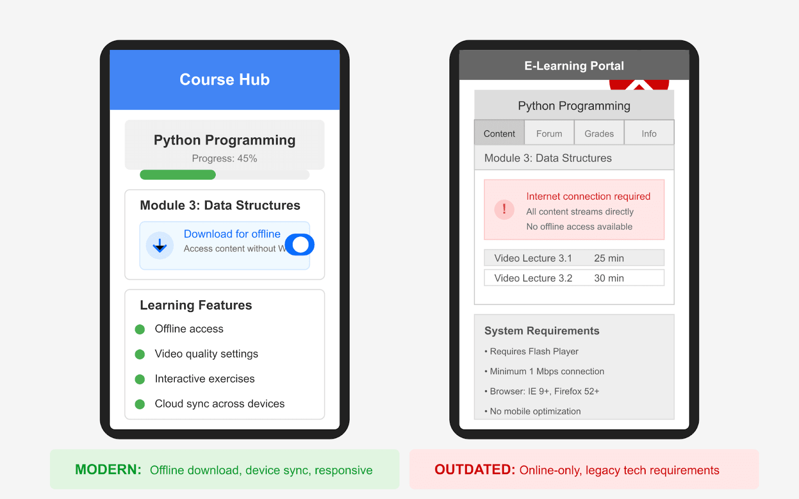
Offline access or downloadable resources: Give learners the option to download lessons, transcripts, or slide decks. This is especially helpful for those in low-connectivity areas or learners who want to study on the go without draining mobile data.
Progress sync across devices: Many learners switch between their laptop, tablet, or phone. Ensuring their progress updates in real-time across all devices avoids frustration and helps them pick up right where they left off.
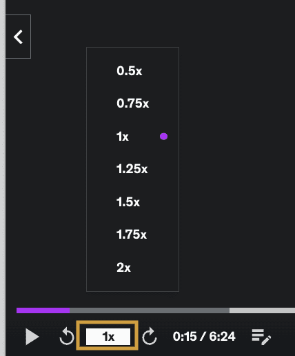
Playback speed control for videos: Some learners prefer speeding through familiar topics, while others need to slow down for complex ones. Giving them control over the pace improves focus and retention.
Resume prompts and reminders: A subtle message like “Continue where you left off” or “Lesson 4 is 80% complete” can nudge learners to stay on track without feeling pushy.
Source
These features are easy to implement and show your learners that you're thinking about their day-to-day experience, not just delivering content.
Bonus Tip 🔥 Tools like Plyr and the Embed Any Document WordPress plugin help you add learner-friendly features without overcomplicating your course. Plyr lets users control video playback speed and resume where they left off, while Embed Any Document makes it easy to offer downloadable resources like transcripts or slides, perfect for offline access and on-the-go learning. |
How Much Optimization Is Too Much?
Let’s face it—there’s no perfect course. But small, smart improvements can make a big difference. And while perfection isn’t possible, testing and finding what works best for your learners is completely in your hands.
Design with your learners in mind. Think about where they are, what devices they use, and how they learn best. Keep the experience smooth, simple, and easy to follow.
Test what’s working. Tweak layouts. Watch how learners interact. Improve one step at a time.
In this blog, we’ve covered:
What responsive eLearning design really means
Why designing only for mobile and desktop isn’t enough
How to adapt layouts for different learner contexts
What to test and why A/B testing matters
How to spot drop-offs early using behavior insights
Simple features that improve the overall experience
We’ve walked you through the key technical flaws that can affect the performance and user experience of your eLearning website and course pages—and how to fix them with a responsive design approach.
If you are still unsure or overwhelmed with these steps, feel free to reach out to us. We can provide you with tailored solutions for your eLearning website issues.
Source
You’ve probably heard the term “responsive” tossed around in web design circles for years. It usually means a site that works well on all screen sizes.
But when it comes to online courses, what does responsive design really look like? And more importantly, how does it impact your learners' experience and your course’s performance?
In this article, we’ll take a closer look at how the concept of responsiveness goes beyond just mobile-friendliness and why it plays a much bigger role in boosting engagement, retention, and enrollments for modern course creators.
The Problem with “Almost Responsive” eLearning Websites
Even if your LMS technically “works,” some subtle design choices might still be holding your course back. Let’s look at a few of those silent blockers.
A Hidden Lag in Interaction Design
Your course might pass the speed test, but does it feel fast?
There’s a big difference between a site that loads in three seconds and one that responds instantly to taps, scrolls, and clicks. If learners are waiting for videos to buffer or if interactive elements like quizzes or buttons respond sluggishly, especially on mobile, it creates friction. Even minor scroll delays can affect how learners perceive your course.
Think of platforms like Netflix. You don’t just want it to open—you expect it to run smoothly, without delays. That’s the same expectation modern learners bring to your LMS.
Fix it: Test your site’s perceived performance using an effective AI tool. Look beyond load time and check metrics like First Input Delay (FID) and Time to Interactive (TTI) to get a more realistic picture.
Related Reading: LMS Performance and Conversion: How Slow Loading Times Affect Enrollments |
The One-Size-Fits-All Design Trap
Just because your theme is labeled “responsive” doesn’t mean it delivers a personalized experience.
If learners on desktops and mobile devices see the exact same layout, or if someone on a weak internet connection is served heavy media files, it can seriously disrupt engagement. What works well on a wide screen with fast Wi-Fi won’t always translate to a phone on 4G in a noisy environment.
It’s like handing the same gear to a mountain climber and a jogger. Technically, it fits, but it’s not designed for how they’re using it.
Fix it: Use context-aware design techniques. Platforms like LearnDash or TutorLMS support conditional content based on device type, screen size, or even network speed. That way, you’re not just resizing—you’re optimizing the experience.
Layout Fatigue: When "Clean" Feels Boring
Minimalist design has its place—but if it leaves learners feeling lost, unmotivated, or unsure of their progress, it’s working against you.
Ask yourself:
Do learners know how far they’ve come in the course?
Are they getting any feedback or encouragement as they move forward?
Does your layout adapt to keep momentum going?
Platforms like Duolingo are great at this. They use progress bars, subtle animations, and even celebratory nudges to keep learners engaged.
Fix it: Try adding lightweight micro-UX elements—like “You’re halfway there” banners, hover effects, or smart transitions between lessons. These touches are easy to implement with lightweight JavaScript and won’t slow down your course.
What Is Responsive eLearning Design?
Responsive eLearning design is all about making sure your course looks good and works well no matter what device someone is using—whether it’s a laptop, tablet, or phone.
Instead of creating different versions for each screen size, you design one course that automatically adjusts itself to fit. The layout, text size, images, and navigation elements rearrange to give learners a smooth experience across devices.
This means:
No awkward zooming or side-scrolling on mobile
Content loads cleanly and clearly on smaller screens
Navigation stays intuitive, whether you're clicking with a mouse or tapping with a thumb
It’s not just about flexibility—it’s about convenience. Learners can start a course on their desktop, continue it on their phone during a commute, and maybe finish it on a tablet later that night, all without any hiccups.
Plus, it’s cost-effective. Instead of hiring a larger team to build and manage different layouts, you can get a great learning experience up and running with fewer hands on deck.
With responsive eLearning design, you're not building a course for devices—you’re building it for learners, no matter how or where they access it.
Responsive eLearning Design in Action Anika is a freelance designer trying to upskill in UX. She starts a module at home on her desktop, but has to leave mid-way to pick up her daughter from school. While waiting in the car, she pulls out her phone and picks up right where she left off—no pinch-zooming, no distorted layouts. Later that night, she reviews a few quizzes on her iPad while relaxing on the couch. In this way, learning becomes continuous—it fits into everyday life, instead of demanding special effort or extra time. |
Now That You Know What Responsive eLearning Design Really Means…
Let’s look at some important things to keep in mind while implementing it.
Because responsive design isn’t just a checkbox—it’s a series of smart, practical decisions that shape how your course performs across devices, screen sizes, and learner environments. From layout choices to interaction patterns, even small tweaks can have a big impact on how learners experience your content.
Here’s what to watch for as you start building a truly responsive eLearning experience.
Go Beyond Just Mobile and Desktop
Yes, mobile usage is huge—and growing. In fact, according to Statista, In the last quarter of 2024, mobile devices (excluding tablets) generated 62.54 percent of global website traffic.
But that doesn’t mean you should stop at designing only for mobile and desktop. Learners today access courses from tablets, smart TVs, convertible devices, and even older PCs. Sticking only to mainstream devices could unintentionally exclude a portion of your audience.
Responsive eLearning should create one version of your course that works across all platforms, without forcing you to design different layouts for each. This not only simplifies your workflow but also ensures a more inclusive learning experience.
Pro tip: If a significant portion of your audience uses older systems, run quick compatibility checks to make sure the experience isn’t broken on those devices.
Source
Responsiveness Means More Than Resizing
A truly responsive design goes well beyond just resizing videos or stacking columns. It considers how interaction and usability change depending on the device in use.
Here’s how you can make that happen:
Show the important stuff first: On smaller screens, bring lesson titles, progress bars, and key actions up front. Save extras for later.
Use swipe-friendly navigation: Instead of hidden menus, make it easy to swipe through lessons, especially on phones and tablets.
Load lighter media on slow connections: Use lower-quality videos or compressed images for learners on weaker networks, so they’re not stuck waiting.
Tap instead of hover: Hover effects don’t work well on touchscreens. Make sure tooltips and buttons respond to taps, not just mouse hovers.
Bonus Tip 🔥 Some older devices or browsers may not fully support responsive features. Run a quick compatibility check before launch, and where possible, offer fallback layouts or simplified views so learners on older systems still have a smooth experience. |
Related Reading: Is Your LMS User Experience Hurting Enrollments? Watch For These Signs |
A/B Test Course Layouts and UX Elements That Actually Matter
Course creators who test layout changes get data-backed insights into what drives engagement, retention, and enrollment.
But if you're only testing button colors or text size, you’re leaving bigger wins on the table.
Smart A/B test ideas:
Progress bar placement: Fixed header vs. footer—what leads to more completions?
Content structure: Should video be front-loaded, or do summaries first help with orientation?
CTA visibility: Do learners respond better to embedded CTAs within modules or ones at the end?
Side nav vs. step-by-step layout: Which helps learners move forward without overwhelm?
Bonus Tip 🔥 Tools like Google Optimize, Convert.com, or WordPress plugins like Elementor Pro can help you run these tests even without deep coding knowledge. Start simple—but test what matters. Layout decisions impact learning flow, and even a 1% boost in engagement per module can compound across a full course. |
Don’t Wait for Sales Reports—Spot Drop-Offs While the Course Is Live
If you wait for post-launch metrics like enrollments or revenue to evaluate your course, you’re missing valuable early warning signs.
Instead, start analyzing engagement as soon as your course is live.
The drop-off reasons could be as simple as:
The intro lesson is too long or text-heavy
Learners don’t know where to go next due to unclear navigation
A video fails to load on slower connections
A CTA isn’t visible on mobile
Quiz loads but doesn’t show completion confirmation
Bonus Tip 🔥 Tools like Microsoft Clarity and PostHog can help track learner engagement and let you spot behavior patterns, drop-off points, or mobile usability issues as they happen. |
Add Lightweight Features That Learners Actually Use
You don’t need to overwhelm your course with flashy features. What learners really appreciate are simple, thoughtful touches that make studying easier, no matter where or how they’re learning.
Here are a few to seriously consider:
Offline access or downloadable resources: Give learners the option to download lessons, transcripts, or slide decks. This is especially helpful for those in low-connectivity areas or learners who want to study on the go without draining mobile data.
Progress sync across devices: Many learners switch between their laptop, tablet, or phone. Ensuring their progress updates in real-time across all devices avoids frustration and helps them pick up right where they left off.
Playback speed control for videos: Some learners prefer speeding through familiar topics, while others need to slow down for complex ones. Giving them control over the pace improves focus and retention.
Resume prompts and reminders: A subtle message like “Continue where you left off” or “Lesson 4 is 80% complete” can nudge learners to stay on track without feeling pushy.
Source
These features are easy to implement and show your learners that you're thinking about their day-to-day experience, not just delivering content.
Bonus Tip 🔥 Tools like Plyr and the Embed Any Document WordPress plugin help you add learner-friendly features without overcomplicating your course. Plyr lets users control video playback speed and resume where they left off, while Embed Any Document makes it easy to offer downloadable resources like transcripts or slides, perfect for offline access and on-the-go learning. |
How Much Optimization Is Too Much?
Let’s face it—there’s no perfect course. But small, smart improvements can make a big difference. And while perfection isn’t possible, testing and finding what works best for your learners is completely in your hands.
Design with your learners in mind. Think about where they are, what devices they use, and how they learn best. Keep the experience smooth, simple, and easy to follow.
Test what’s working. Tweak layouts. Watch how learners interact. Improve one step at a time.
In this blog, we’ve covered:
What responsive eLearning design really means
Why designing only for mobile and desktop isn’t enough
How to adapt layouts for different learner contexts
What to test and why A/B testing matters
How to spot drop-offs early using behavior insights
Simple features that improve the overall experience
We’ve walked you through the key technical flaws that can affect the performance and user experience of your eLearning website and course pages—and how to fix them with a responsive design approach.
If you are still unsure or overwhelmed with these steps, feel free to reach out to us. We can provide you with tailored solutions for your eLearning website issues.
From Ideas to Income: Explore Our e-Learning SEO Solutions

BizBlaze is a subsidiary of WisdmLabs and has been in this space for more than 13 years, so you can be assured you are in safe hands.
Navigation
Contact Info
2035 Sunset Lake Road, Suite B-2, Newark, Delaware, 19702, United States
marketing@wisdmlabs.com
+62 8123 4567
Bizblaze © 2025. All rights reserved