Mobile eLearning Optimization Strategies: Reaching Students Everywhere

May 5, 2025, 12:00 AM
Mobile eLearning Optimization Strategies: Reaching Students Everywhere

Image by Freepik
Let’s Start With the Obvious—Everyone’s on Mobile Now!
Mobile learning isn’t a “maybe we should think about it” kinda thing. It’s already happening.
More than 60% of people access websites on their phones these days—and for course creators like you, that number is probably even higher.
Your learners aren’t sitting at a desk with a cup of coffee and zero distractions. They’re on the bus. In a noisy café. Waiting for their kid at soccer practice. If your course doesn’t work on mobile, it’s kinda broken.
People are squeezing in learning wherever and whenever they can. If your course doesn’t look good or work smoothly on a phone, you’re pushing people away. And it’s not just a matter of design—bad mobile UX can tank your engagement, completions, and reviews before you even realize what’s wrong.

Image by Freepik
Still Making These Mobile eLearning Mistakes? Let’s Fix That
These slip-ups might seem small, but on mobile, they’re deal breakers. Your learners won’t wait for slow videos, hunt for hidden buttons, or rewatch lessons they've already done. The good news? Every one of these mistakes is fixable (without rebuilding your whole course). Let’s walk through what to tweak so your mobile eLearning actually works the way your learners expect it to.
1. Building for Desktop First (And Hoping for the Best)
This one’s a classic. You set everything up on your laptop—it looks sleek, professional, ready to go. Then you open it on your phone and… what the heck happened? Buttons are overlapping, text is microscopic, and the layout's doing cartwheels.
Real-life mess: One course had a beautiful course outline on the desktop. On mobile? The sidebar turned into a bottom scrollable mess that no one could figure out. Learners got lost and bailed.
What to do: Flip the approach. Start small—literally. Build with mobile in mind first. Use responsive themes like Astra or BuddyBoss, and test often.
Try Responsively or BrowserStack to preview your site on real mobile devices (without needing a drawer full of phones).
Did you know? According to Elearning Industry, 94% of Gen Z Are Learning on Their Phones—Is Your LMS Ready? If you’re building an LMS and it’s not mobile-optimized, you’re missing the mark—big time. 94% of Gen Z use their phones for learning. That means if your course feels clunky or slow on mobile, they’ll bounce before you can say “lesson one.” Mobile eLearning isn’t a feature—it’s the foundation. Design for their thumbs, not your desktop.  Image by pikisuperstar freepik |
2. Overloading with Heavy Stuff
Big background images, autoplay videos, animations galore—it all feels cool until your site takes 8 seconds to load on mobile data and your learner is already back on Instagram.
Storytime: One LMS had a welcome video that auto-played in 4 K. Looked amazing on desktop. Crashed half the mobile browsers it loaded on. Smooth.
What to do: Go lean. Compress those images. Disable autoplay. Keep videos short and sweet.
Tools that save the day:
|
3. Never Testing on Actual Phones
This one’s sneaky. You preview in Chrome, it kinda looks okay, and you move on. But Chrome’s “mobile view” isn’t real life. Real phones have weird screen sizes, clumsy fingers, and iffy internet.

Real-life drama: A course quiz worked flawlessly in the laptop version. But on iPhones? The “Submit” button hid behind a sticky footer. Nobody could finish the quiz. 🤦
What to do: Don’t just preview—tap through it on your own phone. Borrow your friend’s Android. Try it on a small screen, in landscape mode, with sketchy Wi-Fi.
Use:
BrowserStack for multi-device testing
Or just… your phone. Keep it real.
4. Progress Doesn’t Sync Across Devices
Picture this: someone starts your course on their tablet at lunch, gets home, opens their phone, and the course resets. Nobody remembers where they left off. That’s a fast track to “meh, I’ll do it later.”
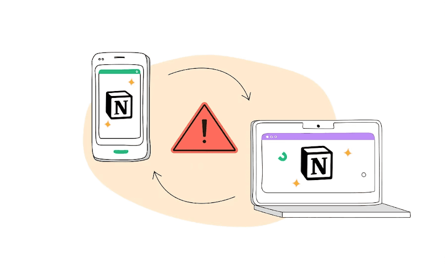
Learner headache: We once got feedback like, “Why do I have to rewatch everything I’ve already done?” Yeah, not great.
What to do: Choose an LMS or plugin setup that syncs progress in real time. Most modern ones (like LearnDash with Tin Canny or Uncanny Toolkit) handle this well.
Bonus tool: WP Fusion can help you track logged-in users and even sync data with CRMs.
5. Burying Your Call-To-Actions
You’ve got a great “Start Now” button. The problem is, on mobile it’s either:
a) shoved into a hamburger menu
b) hidden under a mountain of text
c) completely missing
Real-World Case Study An e-commerce brand partnered with Convertica to improve mobile conversions. Their big move? Adding a sticky “Add to Cart” button that stayed visible as users scrolled. The results were massive:
Keeping the CTA in plain sight made it easier for users to act without hunting around, facilitating a smooth user experience. It proved just how powerful CTA visibility can be, especially on mobile. Source: Convertica Case Study |
Fix it fast: Put your main CTA (buy, resume, enroll) right there—big, bold, and tappable. The top and bottom of the screen are ideal.
6. No Offline Access = No Chill for Learners
Not everyone’s online all the time. Some learners are on patchy connections, flights, or just conserving data. If your course requires perfect internet to work, you’re leaving folks out.
Case in point: A user wanted to review lessons during a 5-hour train ride. No Wi-Fi, no offline mode. They gave up.
Easy wins: Add downloadable transcripts, slides, and cheat sheets. If possible, let them save video lessons offline using tools like Vimeo OTT or course platforms like Thinkific that support offline viewing.

7. Not Having Responsive Assessments (And Losing Learners Fast)
Let’s be real—nobody wants to wrestle with a tiny multiple-choice button on a 5-inch screen while they’re stuck on a bus.
And yet... so many LMS quizzes are basically desktop puzzles that totally fall apart on mobile. Tiny radio buttons, answer fields that cut off mid-word, drag-and-drop quizzes that don't "drop" where they should... It’s brutal.
Imagine One course creator built a super detailed certification exam with drag-and-drop matching questions. On desktop? It looked slick. On mobile? Learners were rage-swiping across the screen, trying to drag answers that refused to move. Half the class dropped out midway through the quiz—not because they didn’t know the answers, but because the test just wouldn’t work on their phones. What to do instead:
|
Mobile eLearning Hacks: What Smart Course Creators Are Doing Right
We’ve roasted the mistakes—now let’s talk about what to do instead. These aren’t rocket science moves, just smart, practical tweaks that make a huge difference for your learners.
1. Design Like Everyone’s Using Their Phone (Because They Probably Are)
Let’s stop pretending people are sitting at a big desk with two monitors. They’re probably on their couch, phone in one hand, snack in the other.
So ditch the sidebars, fancy hover menus, and tiny text. Go for clean, vertical layouts. Big buttons. Scrollable sections. Easy-peasy navigation.

Tools that help:
Use mobile-first themes like Astra or BuddyBoss
Test early with Responsively App or your actual phone (seriously, just open it up!)
2. Make Your Videos Mobile-Friendly (Because No One’s Watching 4K on 3G)
HD is cool—until it eats mobile data like candy and crashes someone’s phone. Mobile learners want smooth playback, maybe captions, and the option to download for later.
Real-life hack: Let people control playback speed (so they can speed-run your course), and offer downloadable slides or PDFs as backups.
Tools that help:
Host on Vimeo or YouTube (unlisted)
Use Loom or ScreenPal to record quick lessons that don’t weigh a ton.
Example John, a course creator, uploaded crisp, full-HD videos to their LMS. Looked amazing on desktop, but mobile learners complained about buffering, lag, and app crashes. After switching to compressed formats and adding playback speed controls, their drop-off rate on video lessons was cut in half. After the analyses, John discovered that over 60% of learners accessed the course via mobile, and most of them were abandoning lessons within the first 2 minutes. |
3. Keep It Fast—Nobody’s Got Time for Spinners
Mobile users are impatient. If your lesson takes more than 3 seconds to load, they’re probably out.
Shrink the fat. Compress your images. Ditch the five-paragraph intros. Make sure every page feels snappy.

Tools that help:
TinyPNG for compressing images
E-learning Technical Health Checker to see what’s slowing you down.
Cloudflare for faster delivery (bonus: it’s free)
4. Build for Thumbs, Not Mice
On mobile, people are tapping, not clicking. And if your buttons are too close together or too tiny to hit without zooming, that’s a rage-click waiting to happen.
Make everything thumb-friendly. Use sticky menus that follow the user. Keep forms short. Avoid dropdowns from hell.
Bonus tip: Put “Resume Learning” or “Next Lesson” where people can easily tap—no hunting required.
Want to know what’s slowing your mobile course down? The eLearning Technical Health Checker is a free tool that scans your site, flags media-heavy pages, and shows you exactly what’s hurting your mobile performance. It gives you clear, prioritized actions—so you’re not just guessing where to start. |
5. Let People Pick Up Where They Left Off
Learners bounce between devices all the time. Tablet at lunch. Phone on the bus. Laptop at night.
If they have to restart every time they switch devices, you’ve lost ‘em.
Tools that help:
LearnDash + Uncanny Toolkit for real-time progress tracking
TutorLMS with sync add-ons
Or consider using WP Fusion to carry user data across platforms.
6. Keep Interactions Simple (Because Drag-and-Drop is a Mess on Mobile)
On a desktop, interactive stuff is fun. On mobile? Not so much. Drag-and-drop, hover-only features, or fill-in-the-blanks are just… annoying.
Keep your activities mobile-proof. Stick with multiple-choice, checkboxes, and short answers. And double-check quizzes on your phone—just to be sure they’re not a pain to use.
How Mobile eLearning (with a Twist of Gaming) Transformed Sales Onboarding: Real Life Case
Background: A rural non-banking finance company (NBFC) in India, with over 1,500 front-line sales executives, aimed to streamline its onboarding process.
Problem:
Way too long (four days off the field = missed sales).
Expensive to run repeatedly in person.
Not accessible for folks in remote areas.
And completely unengaging. Think: long lectures, zero interaction, no follow-up.
Solution:
100% Mobile-Ready: Everything was designed to run smoothly on a phone. Reps could train while commuting, waiting for a client, or even during lunch. No laptop required.
Gamified Learning: They turned onboarding into a game. Points, badges, avatars—the whole nine yards. Learners stayed hooked.
Bite-Sized Lessons: Each module was just long enough to be useful, short enough to do on the go.
Offline-Friendly: Once downloaded, the lessons didn’t need constant internet, crucial for reps in rural areas.
Trackable & Scalable: Plugged into the company’s LMS to track progress and LMS performance, just like any formal training.
Result:
Training time dropped from 4 days to just 5.5 hours.
Engagement shot up because reps actually wanted to use the app.
Access was never an issue—everyone had a phone, and that’s all they needed.
Ongoing learning became possible because reps could pop open the app whenever they needed a quick refresher.
Cost of training went down—fewer trainers, fewer travel costs, way more scale.
Source: https://elearningindustry.com/mobile-game-based-learning-onboarding-sales
Wrapping It Up: Why Mobile eLearning Is Your Secret Weapon
Let’s be real—your learners are busy. They’re scrolling on the train, watching lessons on the go, and trying to sneak in learning between life’s chaos. If your course doesn’t work on mobile, you’re not just behind—you’re invisible to most of your audience.
The good news? Mobile eLearning doesn’t have to be complicated. Start by fixing the basics, and use eLearning Technical Health Checker to see where your mobile experience needs help. Fix what’s broken: make it responsive, keep it light, test it on real phones, and always design with the mobile user in mind.
And hey, the benefits are real:
💸 Lower bounce rates
📈 Higher completion rates
📱 More learners are engaging when and where it works for them
Mobile eLearning Optimization Strategies: Reaching Students Everywhere
Image by Freepik
Let’s Start With the Obvious—Everyone’s on Mobile Now!
Mobile learning isn’t a “maybe we should think about it” kinda thing. It’s already happening.
More than 60% of people access websites on their phones these days—and for course creators like you, that number is probably even higher.
Your learners aren’t sitting at a desk with a cup of coffee and zero distractions. They’re on the bus. In a noisy café. Waiting for their kid at soccer practice. If your course doesn’t work on mobile, it’s kinda broken.
People are squeezing in learning wherever and whenever they can. If your course doesn’t look good or work smoothly on a phone, you’re pushing people away. And it’s not just a matter of design—bad mobile UX can tank your engagement, completions, and reviews before you even realize what’s wrong.
Image by Freepik
Still Making These Mobile eLearning Mistakes? Let’s Fix That
These slip-ups might seem small, but on mobile, they’re deal breakers. Your learners won’t wait for slow videos, hunt for hidden buttons, or rewatch lessons they've already done. The good news? Every one of these mistakes is fixable (without rebuilding your whole course). Let’s walk through what to tweak so your mobile eLearning actually works the way your learners expect it to.
1. Building for Desktop First (And Hoping for the Best)
This one’s a classic. You set everything up on your laptop—it looks sleek, professional, ready to go. Then you open it on your phone and… what the heck happened? Buttons are overlapping, text is microscopic, and the layout's doing cartwheels.
Real-life mess: One course had a beautiful course outline on the desktop. On mobile? The sidebar turned into a bottom scrollable mess that no one could figure out. Learners got lost and bailed.
What to do: Flip the approach. Start small—literally. Build with mobile in mind first. Use responsive themes like Astra or BuddyBoss, and test often.
Try Responsively or BrowserStack to preview your site on real mobile devices (without needing a drawer full of phones).
Did you know? According to Elearning Industry, 94% of Gen Z Are Learning on Their Phones—Is Your LMS Ready? If you’re building an LMS and it’s not mobile-optimized, you’re missing the mark—big time. 94% of Gen Z use their phones for learning. That means if your course feels clunky or slow on mobile, they’ll bounce before you can say “lesson one.” Mobile eLearning isn’t a feature—it’s the foundation. Design for their thumbs, not your desktop. Image by pikisuperstar freepik |
2. Overloading with Heavy Stuff
Big background images, autoplay videos, animations galore—it all feels cool until your site takes 8 seconds to load on mobile data and your learner is already back on Instagram.
Storytime: One LMS had a welcome video that auto-played in 4 K. Looked amazing on desktop. Crashed half the mobile browsers it loaded on. Smooth.
What to do: Go lean. Compress those images. Disable autoplay. Keep videos short and sweet.
Tools that save the day:
|
3. Never Testing on Actual Phones
This one’s sneaky. You preview in Chrome, it kinda looks okay, and you move on. But Chrome’s “mobile view” isn’t real life. Real phones have weird screen sizes, clumsy fingers, and iffy internet.
Real-life drama: A course quiz worked flawlessly in the laptop version. But on iPhones? The “Submit” button hid behind a sticky footer. Nobody could finish the quiz. 🤦
What to do: Don’t just preview—tap through it on your own phone. Borrow your friend’s Android. Try it on a small screen, in landscape mode, with sketchy Wi-Fi.
Use:
BrowserStack for multi-device testing
Or just… your phone. Keep it real.
4. Progress Doesn’t Sync Across Devices
Picture this: someone starts your course on their tablet at lunch, gets home, opens their phone, and the course resets. Nobody remembers where they left off. That’s a fast track to “meh, I’ll do it later.”
Learner headache: We once got feedback like, “Why do I have to rewatch everything I’ve already done?” Yeah, not great.
What to do: Choose an LMS or plugin setup that syncs progress in real time. Most modern ones (like LearnDash with Tin Canny or Uncanny Toolkit) handle this well.
Bonus tool: WP Fusion can help you track logged-in users and even sync data with CRMs.
5. Burying Your Call-To-Actions
You’ve got a great “Start Now” button. The problem is, on mobile it’s either:
a) shoved into a hamburger menu
b) hidden under a mountain of text
c) completely missing
Real-World Case Study An e-commerce brand partnered with Convertica to improve mobile conversions. Their big move? Adding a sticky “Add to Cart” button that stayed visible as users scrolled. The results were massive:
Keeping the CTA in plain sight made it easier for users to act without hunting around, facilitating a smooth user experience. It proved just how powerful CTA visibility can be, especially on mobile. Source: Convertica Case Study |
Fix it fast: Put your main CTA (buy, resume, enroll) right there—big, bold, and tappable. The top and bottom of the screen are ideal.
6. No Offline Access = No Chill for Learners
Not everyone’s online all the time. Some learners are on patchy connections, flights, or just conserving data. If your course requires perfect internet to work, you’re leaving folks out.
Case in point: A user wanted to review lessons during a 5-hour train ride. No Wi-Fi, no offline mode. They gave up.
Easy wins: Add downloadable transcripts, slides, and cheat sheets. If possible, let them save video lessons offline using tools like Vimeo OTT or course platforms like Thinkific that support offline viewing.
7. Not Having Responsive Assessments (And Losing Learners Fast)
Let’s be real—nobody wants to wrestle with a tiny multiple-choice button on a 5-inch screen while they’re stuck on a bus.
And yet... so many LMS quizzes are basically desktop puzzles that totally fall apart on mobile. Tiny radio buttons, answer fields that cut off mid-word, drag-and-drop quizzes that don't "drop" where they should... It’s brutal.
Imagine One course creator built a super detailed certification exam with drag-and-drop matching questions. On desktop? It looked slick. On mobile? Learners were rage-swiping across the screen, trying to drag answers that refused to move. Half the class dropped out midway through the quiz—not because they didn’t know the answers, but because the test just wouldn’t work on their phones. What to do instead:
|
Mobile eLearning Hacks: What Smart Course Creators Are Doing Right
We’ve roasted the mistakes—now let’s talk about what to do instead. These aren’t rocket science moves, just smart, practical tweaks that make a huge difference for your learners.
1. Design Like Everyone’s Using Their Phone (Because They Probably Are)
Let’s stop pretending people are sitting at a big desk with two monitors. They’re probably on their couch, phone in one hand, snack in the other.
So ditch the sidebars, fancy hover menus, and tiny text. Go for clean, vertical layouts. Big buttons. Scrollable sections. Easy-peasy navigation.
Tools that help:
Use mobile-first themes like Astra or BuddyBoss
Test early with Responsively App or your actual phone (seriously, just open it up!)
2. Make Your Videos Mobile-Friendly (Because No One’s Watching 4K on 3G)
HD is cool—until it eats mobile data like candy and crashes someone’s phone. Mobile learners want smooth playback, maybe captions, and the option to download for later.
Real-life hack: Let people control playback speed (so they can speed-run your course), and offer downloadable slides or PDFs as backups.
Tools that help:
Host on Vimeo or YouTube (unlisted)
Use Loom or ScreenPal to record quick lessons that don’t weigh a ton.
Example John, a course creator, uploaded crisp, full-HD videos to their LMS. Looked amazing on desktop, but mobile learners complained about buffering, lag, and app crashes. After switching to compressed formats and adding playback speed controls, their drop-off rate on video lessons was cut in half. After the analyses, John discovered that over 60% of learners accessed the course via mobile, and most of them were abandoning lessons within the first 2 minutes. |
3. Keep It Fast—Nobody’s Got Time for Spinners
Mobile users are impatient. If your lesson takes more than 3 seconds to load, they’re probably out.
Shrink the fat. Compress your images. Ditch the five-paragraph intros. Make sure every page feels snappy.
Tools that help:
TinyPNG for compressing images
E-learning Technical Health Checker to see what’s slowing you down.
Cloudflare for faster delivery (bonus: it’s free)
4. Build for Thumbs, Not Mice
On mobile, people are tapping, not clicking. And if your buttons are too close together or too tiny to hit without zooming, that’s a rage-click waiting to happen.
Make everything thumb-friendly. Use sticky menus that follow the user. Keep forms short. Avoid dropdowns from hell.
Bonus tip: Put “Resume Learning” or “Next Lesson” where people can easily tap—no hunting required.
Want to know what’s slowing your mobile course down? The eLearning Technical Health Checker is a free tool that scans your site, flags media-heavy pages, and shows you exactly what’s hurting your mobile performance. It gives you clear, prioritized actions—so you’re not just guessing where to start. |
5. Let People Pick Up Where They Left Off
Learners bounce between devices all the time. Tablet at lunch. Phone on the bus. Laptop at night.
If they have to restart every time they switch devices, you’ve lost ‘em.
Tools that help:
LearnDash + Uncanny Toolkit for real-time progress tracking
TutorLMS with sync add-ons
Or consider using WP Fusion to carry user data across platforms.
6. Keep Interactions Simple (Because Drag-and-Drop is a Mess on Mobile)
On a desktop, interactive stuff is fun. On mobile? Not so much. Drag-and-drop, hover-only features, or fill-in-the-blanks are just… annoying.
Keep your activities mobile-proof. Stick with multiple-choice, checkboxes, and short answers. And double-check quizzes on your phone—just to be sure they’re not a pain to use.
How Mobile eLearning (with a Twist of Gaming) Transformed Sales Onboarding: Real Life Case
Background: A rural non-banking finance company (NBFC) in India, with over 1,500 front-line sales executives, aimed to streamline its onboarding process.
Problem:
Way too long (four days off the field = missed sales).
Expensive to run repeatedly in person.
Not accessible for folks in remote areas.
And completely unengaging. Think: long lectures, zero interaction, no follow-up.
Solution:
100% Mobile-Ready: Everything was designed to run smoothly on a phone. Reps could train while commuting, waiting for a client, or even during lunch. No laptop required.
Gamified Learning: They turned onboarding into a game. Points, badges, avatars—the whole nine yards. Learners stayed hooked.
Bite-Sized Lessons: Each module was just long enough to be useful, short enough to do on the go.
Offline-Friendly: Once downloaded, the lessons didn’t need constant internet, crucial for reps in rural areas.
Trackable & Scalable: Plugged into the company’s LMS to track progress and LMS performance, just like any formal training.
Result:
Training time dropped from 4 days to just 5.5 hours.
Engagement shot up because reps actually wanted to use the app.
Access was never an issue—everyone had a phone, and that’s all they needed.
Ongoing learning became possible because reps could pop open the app whenever they needed a quick refresher.
Cost of training went down—fewer trainers, fewer travel costs, way more scale.
Source: https://elearningindustry.com/mobile-game-based-learning-onboarding-sales
Wrapping It Up: Why Mobile eLearning Is Your Secret Weapon
Let’s be real—your learners are busy. They’re scrolling on the train, watching lessons on the go, and trying to sneak in learning between life’s chaos. If your course doesn’t work on mobile, you’re not just behind—you’re invisible to most of your audience.
The good news? Mobile eLearning doesn’t have to be complicated. Start by fixing the basics, and use eLearning Technical Health Checker to see where your mobile experience needs help. Fix what’s broken: make it responsive, keep it light, test it on real phones, and always design with the mobile user in mind.
And hey, the benefits are real:
💸 Lower bounce rates
📈 Higher completion rates
📱 More learners are engaging when and where it works for them
From Ideas to Income: Explore Our e-Learning SEO Solutions

BizBlaze is a subsidiary of WisdmLabs and has been in this space for more than 13 years, so you can be assured you are in safe hands.
Navigation
Contact Info
2035 Sunset Lake Road, Suite B-2, Newark, Delaware, 19702, United States
marketing@wisdmlabs.com
+62 8123 4567
Bizblaze © 2025. All rights reserved