Is Your LMS User Experience Hurting Enrollments? Watch For These Signs

Apr 29, 2025, 11:00 AM
Is Your LMS User Experience Hurting Enrollments? Watch For These Signs
The online education market is booming. In 2025, global revenue is projected to reach US$203.81 billion, with an annual growth rate (CAGR) of 8.20% through 2029.
Everyone from recent graduates to seasoned professionals is flocking to online platforms to pick up new skills or explore passions.
And with the robust features of modern Learning Management Systems (LMS), virtually any type of learning can be delivered online.
But here's the catch: despite offering similar functionalities, not every LMS seems to achieve the same level of conversion, user engagement, or retention. So, what’s the reason behind this discrepancy?
It often boils down to one key factor: User Experience.
Even with the most cutting-edge features, your LMS won’t perform if your users can’t navigate it with ease. If their journey is complicated or frustrating, all your efforts to build a great system will be for nothing.
In this blog, we’re going to dig into how you can elevate your LMS user experience and turn those frustrating roadblocks into smooth pathways for your learners. Keep reading to find out how to make your LMS as user-friendly as it is effective.

Source
Hidden Red Flags in Your LMS User Experience
Even the best course content won’t convert if the platform delivering it frustrates learners. Let’s take a look at the most common user experience issues we see in eLearning sites—and how they might be impacting you.
Slow Website Loading Times: No one likes waiting, especially online. A delay of even one second can lead to a significant drop in engagement. Google also penalizes slow sites, which harms your rankings. For example, bounce rates increase by 32% if page load time goes from 1 to 3 seconds.
Slow loading times can frustrate learners and cause them to abandon the site before even accessing the course content. Improving page speed not only enhances user experience but also boosts your SEO performance.
Confusing Navigation: Can students easily find their course modules, quizzes, and certificates? If your site feels like a maze, you’re probably losing learners before they even begin.
A clean, organized layout fosters clarity and confidence. Well-structured navigation ensures learners can quickly find what they’re looking for without unnecessary clicks or frustration.
A clear navigation path also improves overall user satisfaction and reduces bounce rates.
Imagine signing up for a course and not knowing where to start or how to pick up where you left off. It's like driving through a city with no traffic signals or road signs—you're left unsure of where to go next. |

Source
Poor Mobile Responsiveness: More than half of your learners are likely accessing your course via their phones. If your platform isn’t mobile-friendly, you're alienating a huge chunk of your audience.
Pinch-zooming, misaligned buttons, and broken layouts are major turn-offs. Mobile responsiveness ensures your course looks good and functions smoothly on any device, keeping learners engaged.
Without this, learners may struggle to interact with content, causing frustration and ultimately leading to drop-offs.
Broken Links and Glitches: Outdated links or glitchy features (like videos that don’t play or buttons that don’t work) break trust and disrupt the learning process. Each broken link is a roadblock between your student and success.
Technical issues like this make the learning experience feel unprofessional, leading learners to question the platform’s credibility. Regular checks and maintenance can keep these issues in check and maintain the integrity of your platform.
Source
Lack of Visual Consistency: Inconsistent fonts, colors, and spacing can make your site feel unprofessional. A well-designed, consistent interface helps learners focus and makes your course feel more polished.
Consistency in design not only improves aesthetic appeal but also enhances readability and navigation, reducing cognitive load. A visually appealing and cohesive design boosts learner confidence and fosters a positive learning environment.
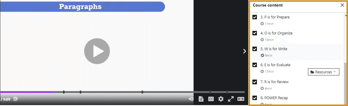
Missing Progress Indicators: Learners want to feel a sense of achievement. Without progress tracking (like checkmarks, status bars, or course completion rates), they may feel lost or unmotivated.
A lack of progress indicators can make learners feel like they’re not making headway, leading to disengagement. Clear progress tracking motivates learners to continue by showing them how much they’ve accomplished and how much is left.
It’s like running a race but not knowing where the finish line is. Without progress indicators, learners can’t see how close they are to completing the course, which can kill motivation. |
No Personalization: Modern learners expect tailored experiences. A generic dashboard or irrelevant course recommendations can make your LMS feel outdated. Personalized learning paths, recommendations, and notifications keep learners engaged and coming back.
Providing content and course suggestions based on learner preferences or progress can increase both satisfaction and course completion rates.
6 Practical Steps to Improve Your LMS User Experience
Now that we've covered the common flaws your eLearning website might have, let's dive into actionable, easy-to-implement steps that will enhance usability and boost learner engagement.
From simplifying access with social logins to optimizing site performance, these practical tips will help you create an LMS that’s both user-friendly and effective.
Social Login Advantage:
Learners today, like most internet users, prefer not to enter their email addresses and passwords on every website. Social logins address this by offering a seamless, one-click sign-in experience, making them a must-have for modern websites.
By integrating social login options, websites can reduce friction, simplify access, and build trust.
Users can quickly sign in with platforms they already use and trust, such as Google or Facebook, which is especially valuable for online course platforms where efficiency is key.
This ease of use boosts user confidence and increases engagement.
Additionally, social logins enhance security by utilizing advanced protection from platforms like Google and Facebook, reducing the risks associated with weak or reused passwords.
In today’s digital landscape, social logins are an essential feature that enhances both user experience and security.

Source
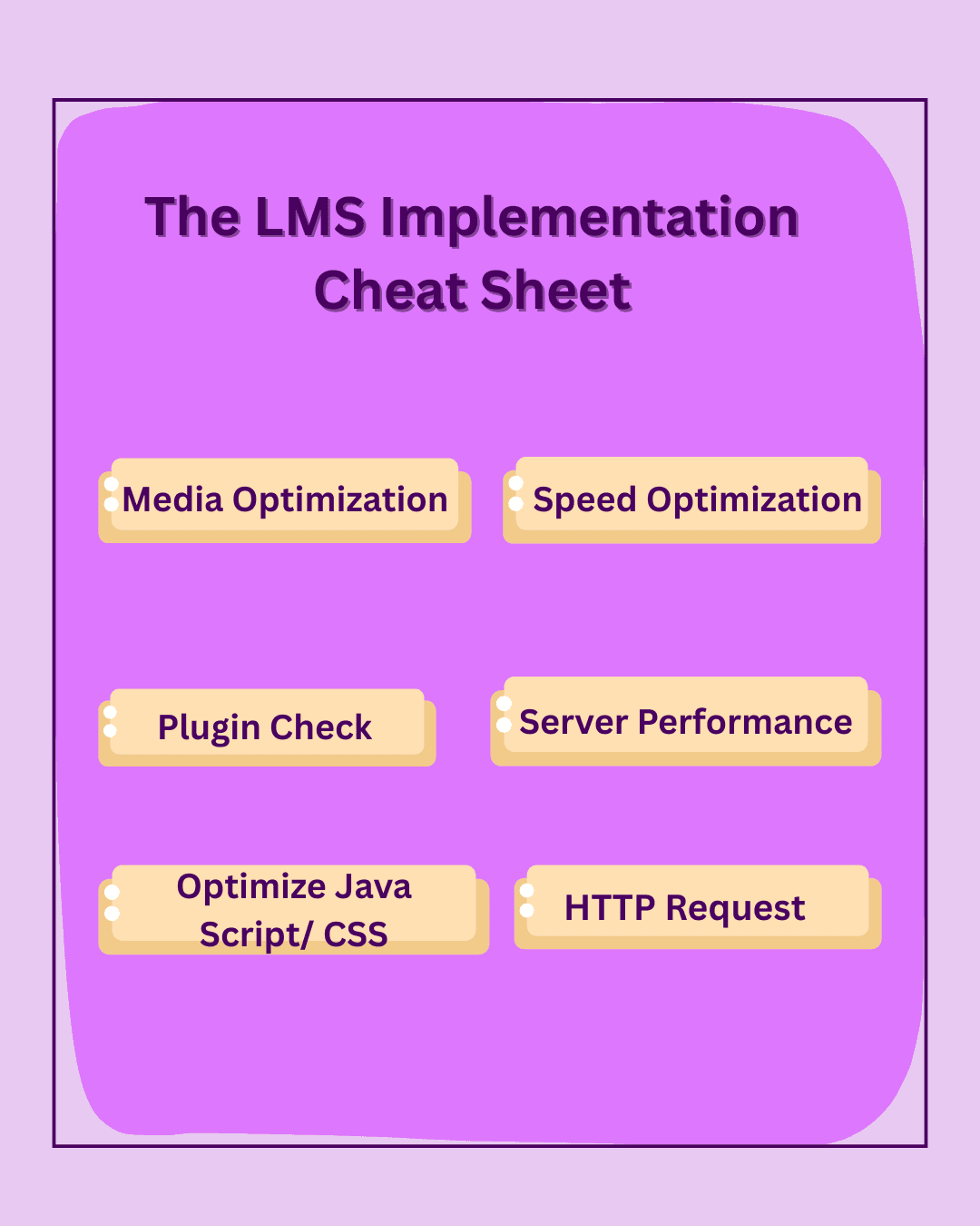
Prioritize Technical Checks:
To ensure a seamless experience for your learners, it’s crucial to optimize your website’s speed. Slow loading times can lead to user frustration, increased bounce rates, and even missed course enrollments.
Here are some common technical issues that could affect your site’s performance, and how they impact user experience:
Large Images and Video Files:
Technical Fault: Images and videos that aren’t optimized can drastically slow down your website.
Effect on UX: Slow-loading media can frustrate users, making them wait before they even see the content. This increases the likelihood of abandonment.
Fix: Compress images and videos to reduce their size without losing quality. Use lazy loading for images, so they load only when visible to the user. For videos, compress them and consider adaptive streaming, which adjusts video quality based on the user’s internet speed, ensuring a smoother experience even for those with slower connections.Too Many Plugins (for WordPress Sites):
Technical Fault: An excessive number of plugins, especially outdated or inefficient ones, can clutter your website and slow it down.
Effect on UX: More plugins lead to more server requests, which can slow down the page loading time and cause page crashes or broken features.
Fix: Regularly review and deactivate unnecessary plugins, and ensure the ones you keep are updated and essential for your site’s functionality.Unoptimized JavaScript & CSS:
Technical Fault: Large, uncompressed JavaScript and CSS files can delay page rendering.
Effect on UX: Slow page rendering leads to long wait times or blank screens, which can cause users to leave your site.
Fix: Minify and combine JavaScript and CSS files to reduce their size and improve page rendering speed.Server Performance Issues:
Technical Fault: A slow or unreliable server can cause significant delays in loading your website.
Effect on UX: Users may face long wait times or timeouts when trying to access your courses, resulting in frustration and decreased trust in your platform.
Fix: Invest in high-performance hosting, and consider upgrading your server resources if needed, especially for high-traffic sites.Uncached Resources:
Technical Fault: Resources like images, scripts, and stylesheets might not be cached, requiring users to reload them with every visit.
Effect on UX: Re-loading the same resources repeatedly wastes time and bandwidth, leading to slower load times for repeat visitors.
Fix: Enable caching, so returning visitors enjoy faster load times without reloading resources.Too Many HTTP Requests:
Technical Fault: Each element (images, scripts, fonts) on a page generates an HTTP request, and too many requests can slow down your site.
Effect on UX: Excessive HTTP requests increase load times, making the website feel sluggish and unresponsive.
Fix: Minimize the number of elements loaded on each page and combine files to reduce HTTP requests.
By addressing these common technical flaws, you can ensure your course page loads quickly, keeps users engaged, and boosts course completion rates. It’s crucial to identify issues like broken links, unoptimized images and videos, and site speed problems to eliminate obstacles for your learners.
Related Reading: Why Slow Loading Times Are Killing Your Course Enrollment Rates |
Go Mobile-First:
In 2025, if your online course isn't optimized for mobile, you're missing out on a massive audience.
With over 5.5 billion internet users worldwide—about 68% of the global population—and 96% of them accessing the internet via mobile devices, it's clear that mobile is the dominant platform for online activity.
Mobile devices now account for 62.5% of global website traffic, underscoring the shift towards mobile-first browsing. Educational apps are also on the rise, with Duolingo leading the charge, boasting over 71 million downloads globally in the first half of 2024.
In India, mobile learning is especially crucial. Many learners in rural areas may not have access to laptops or tablets, but can still access mobile phones. This demographic relies heavily on mobile devices for education, making mobile optimization not just a convenience but a necessity.

Real-Life Analogy: A Corporate Learner's Journey Consider Raj, a mid-level manager in a bustling city. His workday is packed with meetings and deadlines, leaving little time for traditional learning methods. However, during his daily 15-minute train commute, he opens his mobile learning app. The course content is concise, engaging, and perfectly formatted for his phone screen. He watches a short video, takes a quick quiz, and feels accomplished—all before reaching his office. This mobile-first approach allows Raj to integrate learning into his busy schedule seamlessly. By designing your courses with mobile users in mind, you enable learners like Raj to access education anytime, anywhere, leading to higher engagement and completion rates. |
Key Takeaways:
Global Reach: With billions of mobile internet users, your course has the potential to reach a vast audience.
Accessibility: Mobile optimization ensures that learners from all backgrounds, including those in rural areas, can access your content.
Convenience: Learners can engage with your course during short breaks or commutes, making learning a part of their daily routine.
Increased Engagement: A mobile-friendly design leads to better user experience, higher retention, and improved course completion rates.
By adopting a mobile-first strategy, you're not just keeping up with trends—you're making education more accessible, engaging, and effective for today's learners.
Related Reading: Mobile Optimization Strategies for eLearning Businesses: Reaching Students Everywhere |
Easy Navigation & Accessibility:
Your LMS needs to feel welcoming to all kinds of learners—different backgrounds, different preferences, different needs. That’s why your course page layout isn’t just about looking pretty—it’s about helping learners feel at home and stay on track.
Keep It Clear and Accessible: When someone lands on your course page, they shouldn’t be wondering, “Where do I even start?” Show them the essentials right away—course goals, what they’ll learn, how long it’ll take, and where to begin.
Offer simple personalization touches too, like multi-language support, local date/time formats, and accessibility tools for learners with disabilities. These small things make a big difference in creating an inclusive space.
Source
Make the UI Learner-Friendly: Use a clean layout with plenty of breathing room—no one likes reading a wall of text. Stick to one color scheme to keep things visually consistent, and make sure buttons and CTAs stand out clearly.
Even if your LMS is packed with features, they need to be easy to find and use. If learners can’t figure out how to move through modules or submit assignments, they’re going to bounce. Good UX isn’t optional—it’s what keeps learners coming back.
Quick Analogy: You don’t want to waste time scrolling through each menu—you just want to find desserts, like, right now. You want to see the restaurant name, ratings, delivery time, and prices all in one place, no hassle. Well, that’s exactly how your course page should work—give learners what they need right away, without all the confusion. |
Trust Builders:
Building trust with your learners is key to increasing engagement and course enrollment. One powerful way to establish trust is by incorporating social proof into your course page. Social proof, such as learner testimonials, success stories, and course ratings, helps reassure new visitors that your course is credible and valuable.
Take Surveys / Add FAQs: Adding surveys and frequently asked questions (FAQs) on your course page gives potential learners insight into what others have experienced and provides answers to common concerns. This transparency creates a sense of reliability and encourages prospective students to take the leap and enroll.
Here is an example of a well-designed FAQ section with relevant resource links included in each response:

Source
Include Testimonials on Course Page: Showcasing testimonials directly from your learners on the course page adds authenticity to your course. A quote like "I landed my first freelance gig two weeks after finishing this course" immediately boosts credibility and demonstrates the real-world impact of your course. This kind of feedback assures visitors that they’ll gain valuable skills, increasing their confidence in your program.
Incorporating these trust-building elements into your LMS will not only enhance credibility but also foster a deeper connection with your learners, ultimately leading to better engagement and higher conversion rates.

Source
Automate UX Checks & Fixes:
AI has evolved significantly and offers much more than just content enhancement. It can now help refine your website layout and overall performance.
Tools like the eLearning Technical Health Checker can analyze and identify technical flaws on your site, providing you with actionable insights. Once these issues are identified, you can create customized AI prompts to find simple solutions.
To make the prompts more effective, be sure to include the following key details:
The website URL
The technical issues identified in the AI tool’s report
Here’s an example of how you can structure the AI prompt to get practical fixes for these issues:
You are an online course creator, and your website is facing certain technical issues. These issues were identified using an AI tool designed to analyze website performance. Website URL: Identified Technical Issues:
Action Plan Request: Desired Outcome: Output: 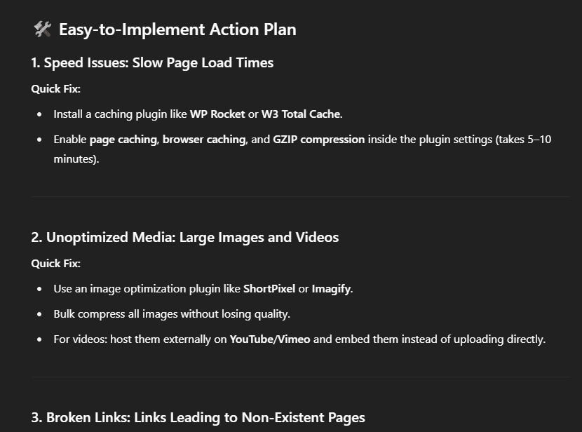 |
Why LMS User Experience Can Make or Break Your Course
Learners today expect seamless, fast, and easy-to-use platforms. If your LMS is slow or hard to navigate, even the best content won’t keep them engaged. A poor user experience can turn potential students away before they even click "Enroll."
On the other hand, a smooth, mobile-friendly LMS builds trust, boosts engagement, and increases conversions.
For instance, a study conducted at the University of Cape Coast (UCC) in Ghana evaluated the impact of Learning Management System (LMS) integration on student performance and engagement.
The findings indicated that students who actively engaged with the LMS demonstrated improved academic performance and higher levels of satisfaction compared to those who had limited interaction with the platform. This underscores the effectiveness of an interactive LMS on the learner journey.
Bonus Tip: Record a walkthrough of your site from a learner’s perspective to spot any UX issues.
How Much of This Guide Do You Actually Need?
Well, if you're new to online course creation or have been creating courses for a while but haven’t yet considered how your website’s UX may be impacting enrollments, you should read this guide thoroughly.
A successful LMS isn’t just about delivering great content—it’s about crafting an experience that leaves a lasting impression on your learners. In this guide, we have covered key points, including:
Slow load times, broken links, and a clunky mobile design can kill your site’s engagement without you even noticing.
Clear navigation and a clean design help build trust and keep learners coming back.
Regular checks and simple tools can keep your site running smoothly.
Personalization and feedback loops make a huge difference in keeping learners happy and engaged.
A well-thought-out layout, strong CTAs, and social proof like testimonials and FAQs go a long way in creating great first impressions.
But remember, these are just the first steps. If you want to uncover deeper technical issues on your eLearning site, a reliable AI tool can help surface the insights that really matter. And if it still feels a bit overwhelming, the team at BizBlaze is here to help you handle the technical and SEO side, so you can stay focused on what you love most. Let’s build an amazing eLearning experience for your students together..
Is Your LMS User Experience Hurting Enrollments? Watch For These Signs
The online education market is booming. In 2025, global revenue is projected to reach US$203.81 billion, with an annual growth rate (CAGR) of 8.20% through 2029.
Everyone from recent graduates to seasoned professionals is flocking to online platforms to pick up new skills or explore passions.
And with the robust features of modern Learning Management Systems (LMS), virtually any type of learning can be delivered online.
But here's the catch: despite offering similar functionalities, not every LMS seems to achieve the same level of conversion, user engagement, or retention. So, what’s the reason behind this discrepancy?
It often boils down to one key factor: User Experience.
Even with the most cutting-edge features, your LMS won’t perform if your users can’t navigate it with ease. If their journey is complicated or frustrating, all your efforts to build a great system will be for nothing.
In this blog, we’re going to dig into how you can elevate your LMS user experience and turn those frustrating roadblocks into smooth pathways for your learners. Keep reading to find out how to make your LMS as user-friendly as it is effective.
Source
Hidden Red Flags in Your LMS User Experience
Even the best course content won’t convert if the platform delivering it frustrates learners. Let’s take a look at the most common user experience issues we see in eLearning sites—and how they might be impacting you.
Slow Website Loading Times: No one likes waiting, especially online. A delay of even one second can lead to a significant drop in engagement. Google also penalizes slow sites, which harms your rankings. For example, bounce rates increase by 32% if page load time goes from 1 to 3 seconds.
Slow loading times can frustrate learners and cause them to abandon the site before even accessing the course content. Improving page speed not only enhances user experience but also boosts your SEO performance.
Confusing Navigation: Can students easily find their course modules, quizzes, and certificates? If your site feels like a maze, you’re probably losing learners before they even begin.
A clean, organized layout fosters clarity and confidence. Well-structured navigation ensures learners can quickly find what they’re looking for without unnecessary clicks or frustration.
A clear navigation path also improves overall user satisfaction and reduces bounce rates.
Imagine signing up for a course and not knowing where to start or how to pick up where you left off. It's like driving through a city with no traffic signals or road signs—you're left unsure of where to go next. |
Source
Poor Mobile Responsiveness: More than half of your learners are likely accessing your course via their phones. If your platform isn’t mobile-friendly, you're alienating a huge chunk of your audience.
Pinch-zooming, misaligned buttons, and broken layouts are major turn-offs. Mobile responsiveness ensures your course looks good and functions smoothly on any device, keeping learners engaged.
Without this, learners may struggle to interact with content, causing frustration and ultimately leading to drop-offs.
Broken Links and Glitches: Outdated links or glitchy features (like videos that don’t play or buttons that don’t work) break trust and disrupt the learning process. Each broken link is a roadblock between your student and success.
Technical issues like this make the learning experience feel unprofessional, leading learners to question the platform’s credibility. Regular checks and maintenance can keep these issues in check and maintain the integrity of your platform.
Source
Lack of Visual Consistency: Inconsistent fonts, colors, and spacing can make your site feel unprofessional. A well-designed, consistent interface helps learners focus and makes your course feel more polished.
Consistency in design not only improves aesthetic appeal but also enhances readability and navigation, reducing cognitive load. A visually appealing and cohesive design boosts learner confidence and fosters a positive learning environment.
Missing Progress Indicators: Learners want to feel a sense of achievement. Without progress tracking (like checkmarks, status bars, or course completion rates), they may feel lost or unmotivated.
A lack of progress indicators can make learners feel like they’re not making headway, leading to disengagement. Clear progress tracking motivates learners to continue by showing them how much they’ve accomplished and how much is left.
It’s like running a race but not knowing where the finish line is. Without progress indicators, learners can’t see how close they are to completing the course, which can kill motivation. |
No Personalization: Modern learners expect tailored experiences. A generic dashboard or irrelevant course recommendations can make your LMS feel outdated. Personalized learning paths, recommendations, and notifications keep learners engaged and coming back.
Providing content and course suggestions based on learner preferences or progress can increase both satisfaction and course completion rates.
6 Practical Steps to Improve Your LMS User Experience
Now that we've covered the common flaws your eLearning website might have, let's dive into actionable, easy-to-implement steps that will enhance usability and boost learner engagement.
From simplifying access with social logins to optimizing site performance, these practical tips will help you create an LMS that’s both user-friendly and effective.
Social Login Advantage:
Learners today, like most internet users, prefer not to enter their email addresses and passwords on every website. Social logins address this by offering a seamless, one-click sign-in experience, making them a must-have for modern websites.
By integrating social login options, websites can reduce friction, simplify access, and build trust.
Users can quickly sign in with platforms they already use and trust, such as Google or Facebook, which is especially valuable for online course platforms where efficiency is key.
This ease of use boosts user confidence and increases engagement.
Additionally, social logins enhance security by utilizing advanced protection from platforms like Google and Facebook, reducing the risks associated with weak or reused passwords.
In today’s digital landscape, social logins are an essential feature that enhances both user experience and security.
Source
Prioritize Technical Checks:
To ensure a seamless experience for your learners, it’s crucial to optimize your website’s speed. Slow loading times can lead to user frustration, increased bounce rates, and even missed course enrollments.
Here are some common technical issues that could affect your site’s performance, and how they impact user experience:
Large Images and Video Files:
Technical Fault: Images and videos that aren’t optimized can drastically slow down your website.
Effect on UX: Slow-loading media can frustrate users, making them wait before they even see the content. This increases the likelihood of abandonment.
Fix: Compress images and videos to reduce their size without losing quality. Use lazy loading for images, so they load only when visible to the user. For videos, compress them and consider adaptive streaming, which adjusts video quality based on the user’s internet speed, ensuring a smoother experience even for those with slower connections.Too Many Plugins (for WordPress Sites):
Technical Fault: An excessive number of plugins, especially outdated or inefficient ones, can clutter your website and slow it down.
Effect on UX: More plugins lead to more server requests, which can slow down the page loading time and cause page crashes or broken features.
Fix: Regularly review and deactivate unnecessary plugins, and ensure the ones you keep are updated and essential for your site’s functionality.Unoptimized JavaScript & CSS:
Technical Fault: Large, uncompressed JavaScript and CSS files can delay page rendering.
Effect on UX: Slow page rendering leads to long wait times or blank screens, which can cause users to leave your site.
Fix: Minify and combine JavaScript and CSS files to reduce their size and improve page rendering speed.Server Performance Issues:
Technical Fault: A slow or unreliable server can cause significant delays in loading your website.
Effect on UX: Users may face long wait times or timeouts when trying to access your courses, resulting in frustration and decreased trust in your platform.
Fix: Invest in high-performance hosting, and consider upgrading your server resources if needed, especially for high-traffic sites.Uncached Resources:
Technical Fault: Resources like images, scripts, and stylesheets might not be cached, requiring users to reload them with every visit.
Effect on UX: Re-loading the same resources repeatedly wastes time and bandwidth, leading to slower load times for repeat visitors.
Fix: Enable caching, so returning visitors enjoy faster load times without reloading resources.Too Many HTTP Requests:
Technical Fault: Each element (images, scripts, fonts) on a page generates an HTTP request, and too many requests can slow down your site.
Effect on UX: Excessive HTTP requests increase load times, making the website feel sluggish and unresponsive.
Fix: Minimize the number of elements loaded on each page and combine files to reduce HTTP requests.
By addressing these common technical flaws, you can ensure your course page loads quickly, keeps users engaged, and boosts course completion rates. It’s crucial to identify issues like broken links, unoptimized images and videos, and site speed problems to eliminate obstacles for your learners.
Related Reading: Why Slow Loading Times Are Killing Your Course Enrollment Rates |
Go Mobile-First:
In 2025, if your online course isn't optimized for mobile, you're missing out on a massive audience.
With over 5.5 billion internet users worldwide—about 68% of the global population—and 96% of them accessing the internet via mobile devices, it's clear that mobile is the dominant platform for online activity.
Mobile devices now account for 62.5% of global website traffic, underscoring the shift towards mobile-first browsing. Educational apps are also on the rise, with Duolingo leading the charge, boasting over 71 million downloads globally in the first half of 2024.
In India, mobile learning is especially crucial. Many learners in rural areas may not have access to laptops or tablets, but can still access mobile phones. This demographic relies heavily on mobile devices for education, making mobile optimization not just a convenience but a necessity.
Real-Life Analogy: A Corporate Learner's Journey Consider Raj, a mid-level manager in a bustling city. His workday is packed with meetings and deadlines, leaving little time for traditional learning methods. However, during his daily 15-minute train commute, he opens his mobile learning app. The course content is concise, engaging, and perfectly formatted for his phone screen. He watches a short video, takes a quick quiz, and feels accomplished—all before reaching his office. This mobile-first approach allows Raj to integrate learning into his busy schedule seamlessly. By designing your courses with mobile users in mind, you enable learners like Raj to access education anytime, anywhere, leading to higher engagement and completion rates. |
Key Takeaways:
Global Reach: With billions of mobile internet users, your course has the potential to reach a vast audience.
Accessibility: Mobile optimization ensures that learners from all backgrounds, including those in rural areas, can access your content.
Convenience: Learners can engage with your course during short breaks or commutes, making learning a part of their daily routine.
Increased Engagement: A mobile-friendly design leads to better user experience, higher retention, and improved course completion rates.
By adopting a mobile-first strategy, you're not just keeping up with trends—you're making education more accessible, engaging, and effective for today's learners.
Related Reading: Mobile Optimization Strategies for eLearning Businesses: Reaching Students Everywhere |
Easy Navigation & Accessibility:
Your LMS needs to feel welcoming to all kinds of learners—different backgrounds, different preferences, different needs. That’s why your course page layout isn’t just about looking pretty—it’s about helping learners feel at home and stay on track.
Keep It Clear and Accessible: When someone lands on your course page, they shouldn’t be wondering, “Where do I even start?” Show them the essentials right away—course goals, what they’ll learn, how long it’ll take, and where to begin.
Offer simple personalization touches too, like multi-language support, local date/time formats, and accessibility tools for learners with disabilities. These small things make a big difference in creating an inclusive space.
Source
Make the UI Learner-Friendly: Use a clean layout with plenty of breathing room—no one likes reading a wall of text. Stick to one color scheme to keep things visually consistent, and make sure buttons and CTAs stand out clearly.
Even if your LMS is packed with features, they need to be easy to find and use. If learners can’t figure out how to move through modules or submit assignments, they’re going to bounce. Good UX isn’t optional—it’s what keeps learners coming back.
Quick Analogy: You don’t want to waste time scrolling through each menu—you just want to find desserts, like, right now. You want to see the restaurant name, ratings, delivery time, and prices all in one place, no hassle. Well, that’s exactly how your course page should work—give learners what they need right away, without all the confusion. |
Trust Builders:
Building trust with your learners is key to increasing engagement and course enrollment. One powerful way to establish trust is by incorporating social proof into your course page. Social proof, such as learner testimonials, success stories, and course ratings, helps reassure new visitors that your course is credible and valuable.
Take Surveys / Add FAQs: Adding surveys and frequently asked questions (FAQs) on your course page gives potential learners insight into what others have experienced and provides answers to common concerns. This transparency creates a sense of reliability and encourages prospective students to take the leap and enroll.
Here is an example of a well-designed FAQ section with relevant resource links included in each response:
Source
Include Testimonials on Course Page: Showcasing testimonials directly from your learners on the course page adds authenticity to your course. A quote like "I landed my first freelance gig two weeks after finishing this course" immediately boosts credibility and demonstrates the real-world impact of your course. This kind of feedback assures visitors that they’ll gain valuable skills, increasing their confidence in your program.
Incorporating these trust-building elements into your LMS will not only enhance credibility but also foster a deeper connection with your learners, ultimately leading to better engagement and higher conversion rates.
Source
Automate UX Checks & Fixes:
AI has evolved significantly and offers much more than just content enhancement. It can now help refine your website layout and overall performance.
Tools like the eLearning Technical Health Checker can analyze and identify technical flaws on your site, providing you with actionable insights. Once these issues are identified, you can create customized AI prompts to find simple solutions.
To make the prompts more effective, be sure to include the following key details:
The website URL
The technical issues identified in the AI tool’s report
Here’s an example of how you can structure the AI prompt to get practical fixes for these issues:
You are an online course creator, and your website is facing certain technical issues. These issues were identified using an AI tool designed to analyze website performance. Website URL: Identified Technical Issues:
Action Plan Request: Desired Outcome: Output: |
Why LMS User Experience Can Make or Break Your Course
Learners today expect seamless, fast, and easy-to-use platforms. If your LMS is slow or hard to navigate, even the best content won’t keep them engaged. A poor user experience can turn potential students away before they even click "Enroll."
On the other hand, a smooth, mobile-friendly LMS builds trust, boosts engagement, and increases conversions.
For instance, a study conducted at the University of Cape Coast (UCC) in Ghana evaluated the impact of Learning Management System (LMS) integration on student performance and engagement.
The findings indicated that students who actively engaged with the LMS demonstrated improved academic performance and higher levels of satisfaction compared to those who had limited interaction with the platform. This underscores the effectiveness of an interactive LMS on the learner journey.
Bonus Tip: Record a walkthrough of your site from a learner’s perspective to spot any UX issues.
How Much of This Guide Do You Actually Need?
Well, if you're new to online course creation or have been creating courses for a while but haven’t yet considered how your website’s UX may be impacting enrollments, you should read this guide thoroughly.
A successful LMS isn’t just about delivering great content—it’s about crafting an experience that leaves a lasting impression on your learners. In this guide, we have covered key points, including:
Slow load times, broken links, and a clunky mobile design can kill your site’s engagement without you even noticing.
Clear navigation and a clean design help build trust and keep learners coming back.
Regular checks and simple tools can keep your site running smoothly.
Personalization and feedback loops make a huge difference in keeping learners happy and engaged.
A well-thought-out layout, strong CTAs, and social proof like testimonials and FAQs go a long way in creating great first impressions.
But remember, these are just the first steps. If you want to uncover deeper technical issues on your eLearning site, a reliable AI tool can help surface the insights that really matter. And if it still feels a bit overwhelming, the team at BizBlaze is here to help you handle the technical and SEO side, so you can stay focused on what you love most. Let’s build an amazing eLearning experience for your students together..
From Ideas to Income: Explore Our e-Learning SEO Solutions

BizBlaze is a subsidiary of WisdmLabs and has been in this space for more than 13 years, so you can be assured you are in safe hands.
Navigation
Contact Info
2035 Sunset Lake Road, Suite B-2, Newark, Delaware, 19702, United States
marketing@wisdmlabs.com
+62 8123 4567
Bizblaze © 2025. All rights reserved